homage style

when your home is your canvas

schedule a design consult
  • blog
  • services
    • styling & decorating
    • home staging
    • virtual home staging
  • featured
  • about
  • workshops
  • contact
  • subscribe

when things get boring in the bedroom

11 September 2014 by Andrea Leave a Comment

when things get boring in the bedroom

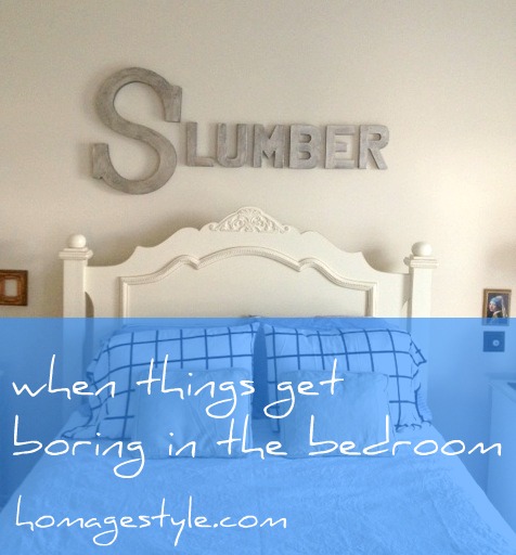
Sometimes things get boring in the bedroom. Stale. Just the same old thing, day after day, week after week, month after month. A sense of ennui sets in and all you can think about is how something has to change. You just can’t continue the way things are.

No, I don’t mean that has gotten boring! I mean your decor has. Geez, you people always have your minds in the gutter!

Well, when things have gotten dull, spice it up! Consider it a marriage encounter for your decor!

Recently I was feeling bored (with my decor) and so I decided to spruce things up a bit. As always, I’m on a tight budget, so it included a combination of rearranging some of what I already have, using some things that have been curing for years, and adding a little bit of new to the mix.

In general, I’m moving from a more traditional look to a more eclectic look – vintage and shabby chic marry mod. OK, so that’s more of a threesome than a traditional marriage, but when we’re decorating we don’t always need to follow societal norms!

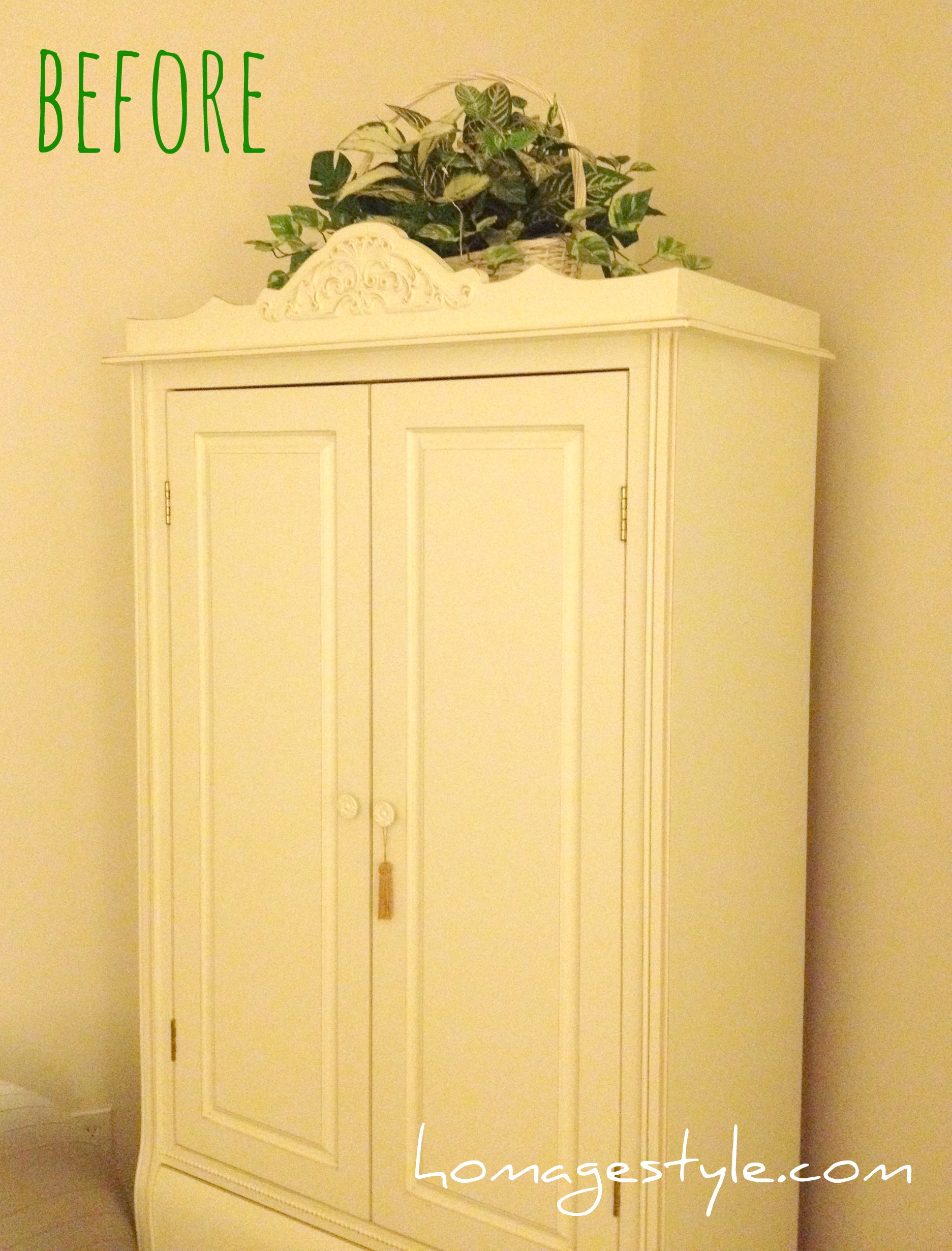
Let’s start with the armoire. Here’s the before pic, with fake plants that look just fine, but no doubt more in the traditional vein…

Armoire beforeGoodbye fake plants, hello gold dress form trussed in faerie lights!

Armoire after with lights
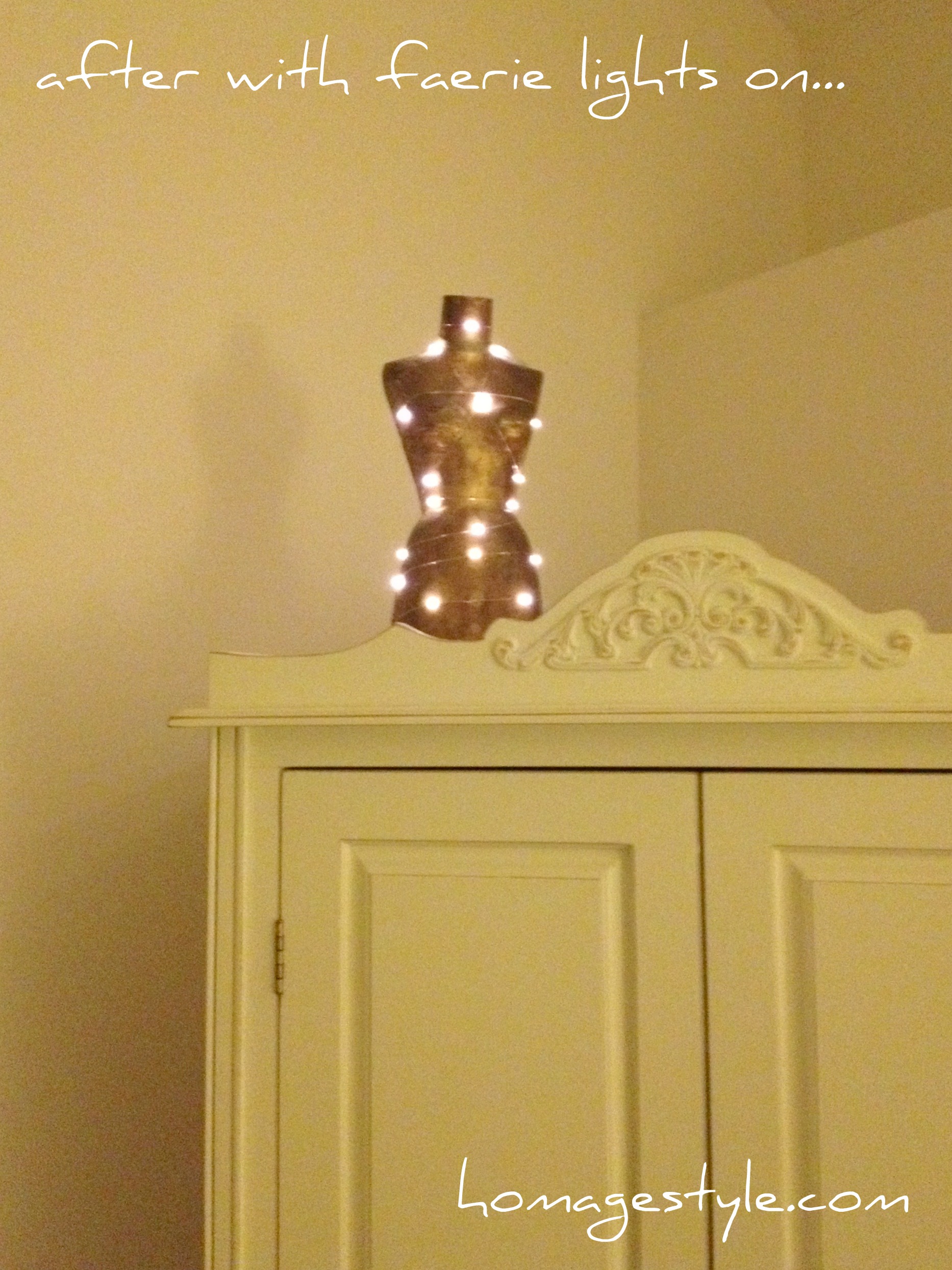
The faerie lights were $11.99 plus shipping. Well worth the expense. They’re battery operated, so there are no pesky wires running over the side of the armoire. Plus they run on a timer, so I can turn them on and six hours later they go off automatically. Perfect for when you need to spice things up with some ambiance!

Here’s how it looks during the day with the lights off…

Armoire after in daylight
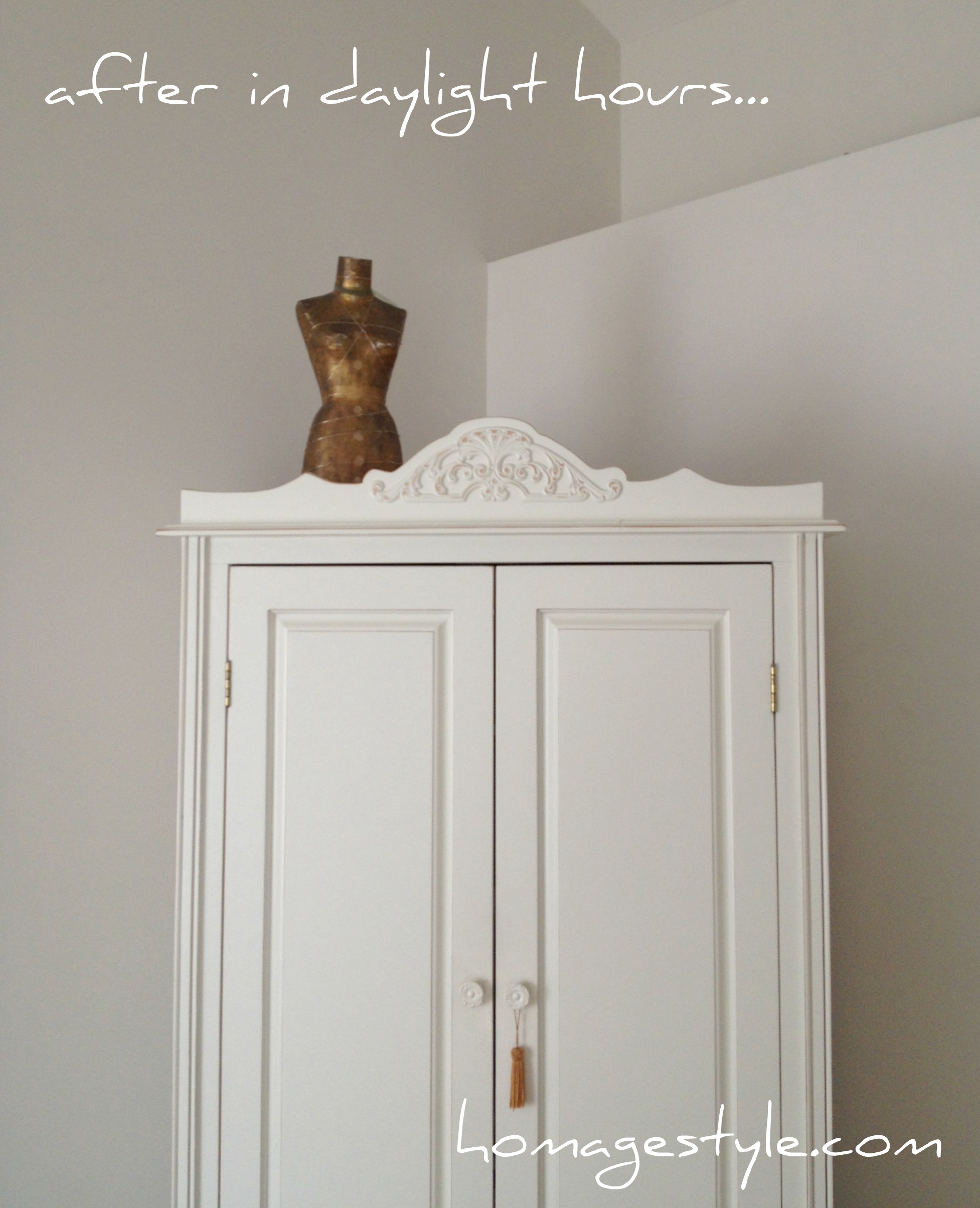
You will notice that the dress form is off center, and there’s a lot of empty, open space on the top of the armoire. I’m really trying to get OK with imperfection. That includes getting comfortable with negative space and off-center presentation. I’ve actually grown to love the oddness of it all…it really highlights the dress form as the featured element.

Speaking of the dress form, this beauty has been curing for years! I purchased her for $1.25 at a local high school rummage sale. Been waiting to find the perfect place for her. Think I’ve found it!

Moving on…

Let’s take a look at one of my favorite possessions. A Picasso print of A Mother and Child and Four Studies of Her Right Hand. This was my grandmother’s print and I always loved it in her home from the time I was a kid. I’ve had it in my bedroom since I got it, but thought it needed to be featured a little more prominently, so I added some black and white polka dotted washi tape to frame it out…

Picasso print 1
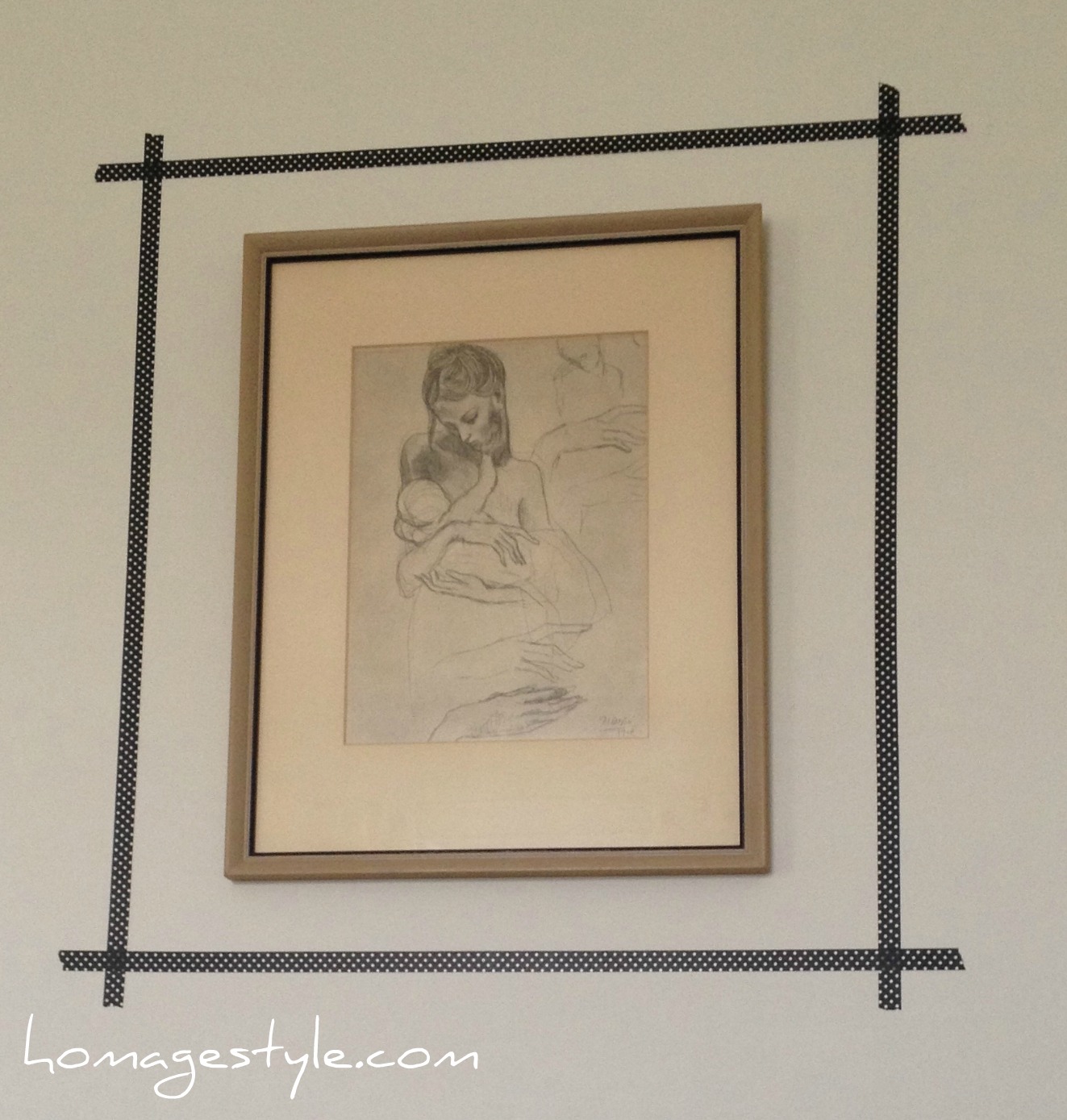
I just eyeballed the tape placement, because that’s what I do, but you could always be more precise and measure it out like a normal human.

(If you’re wondering why I have such weird angles with the wall hangings, it’s because I get a lot of light in this room so the angle is the only way to avoid glare in the pic. Carry on…)

Another angle…

Picasso print
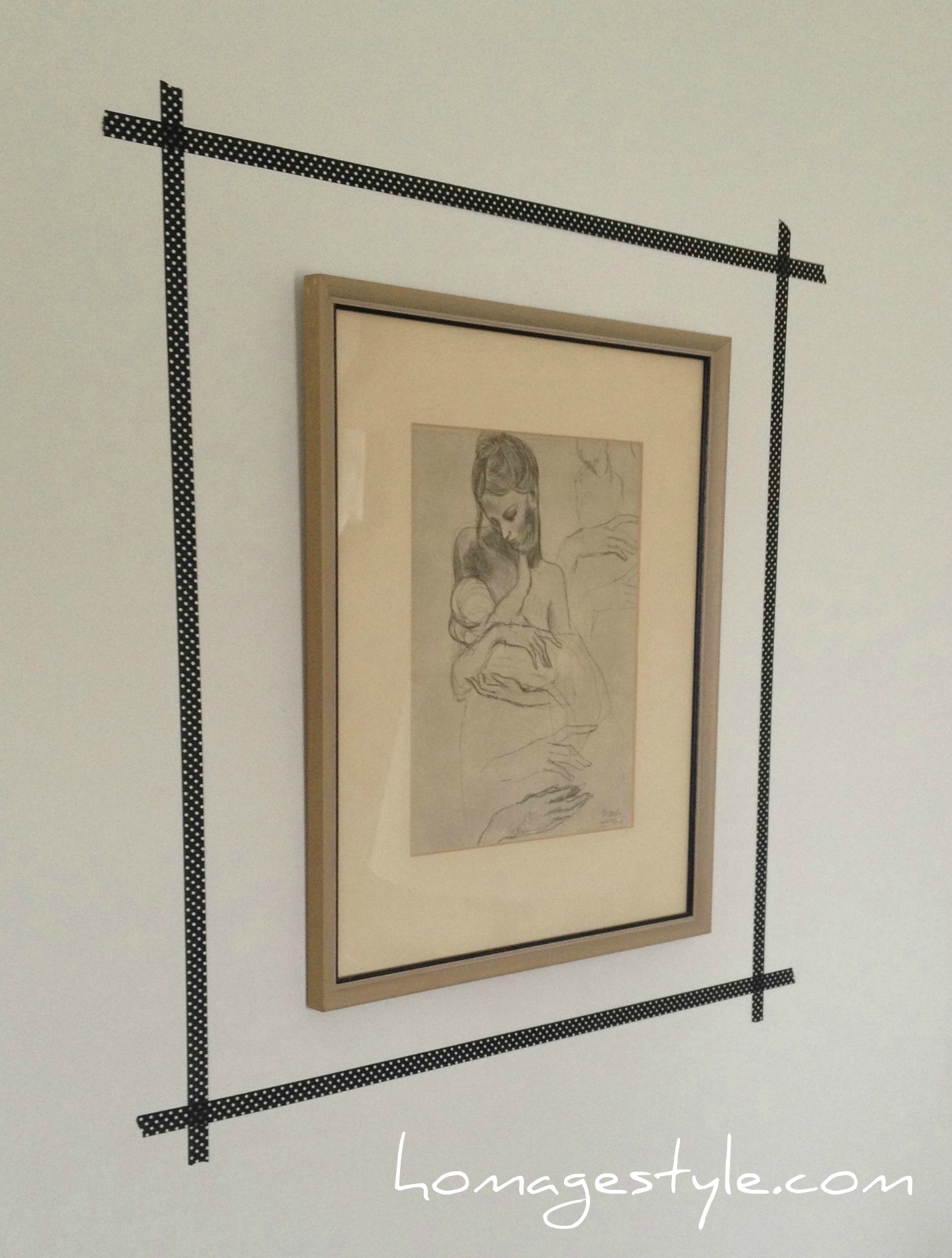
I love, love, love how this looks! It really brings out the tiny, black rim on the frame, as well as the black in the sketch. Plus the washi tape was a steal – I got 3 rolls for $2.99 at Michaels. More to come later with one of the other rolls of tape.

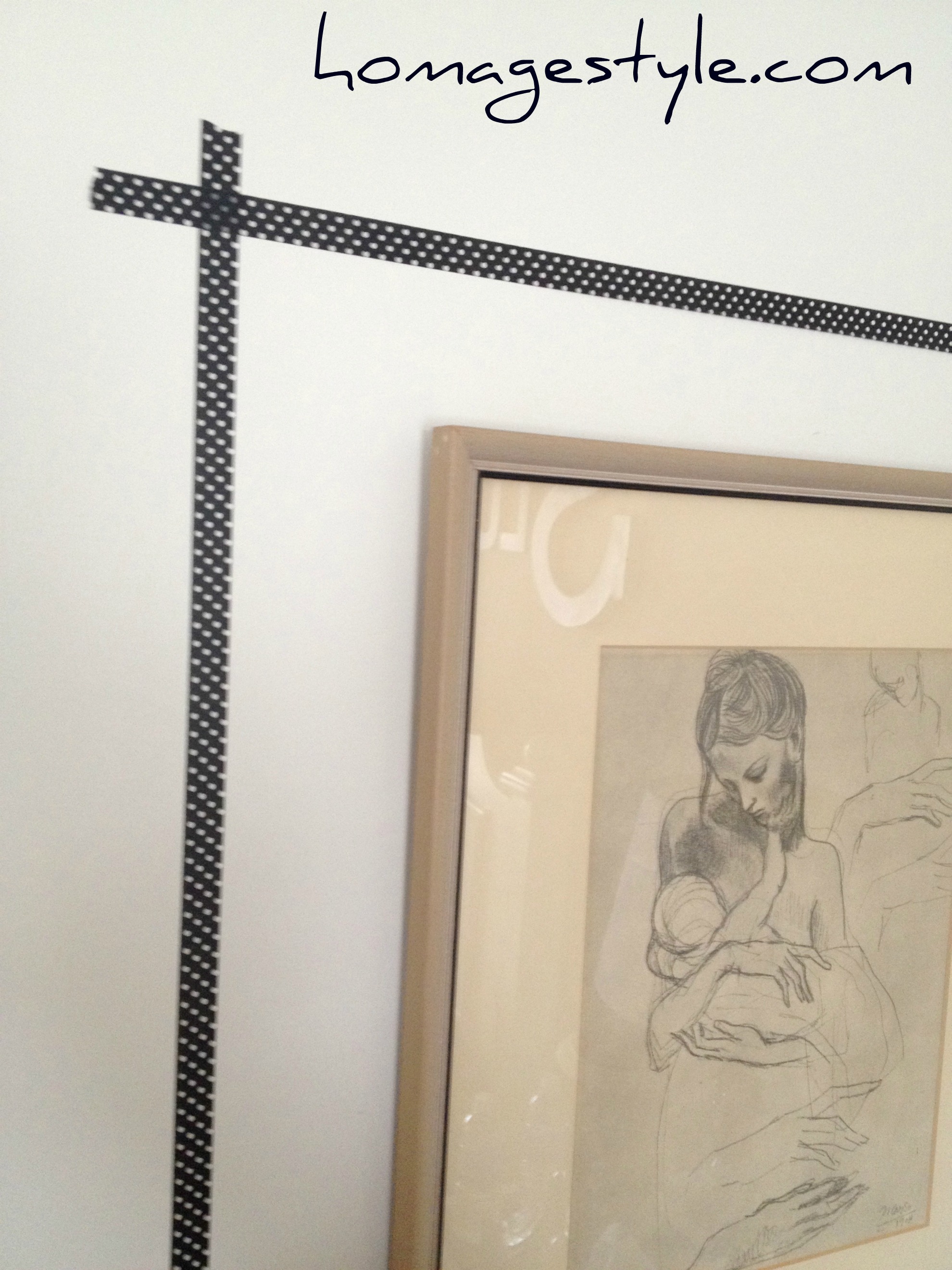
By the way, polka dots are my fave. Especially black and white polka dots. So this just makes me happy every single day when I see it! Here’s a close-up so you can better see the polka dots (as well as the aforementioned glare)…

Picasso print 2Enough about that. On to the one splurge.

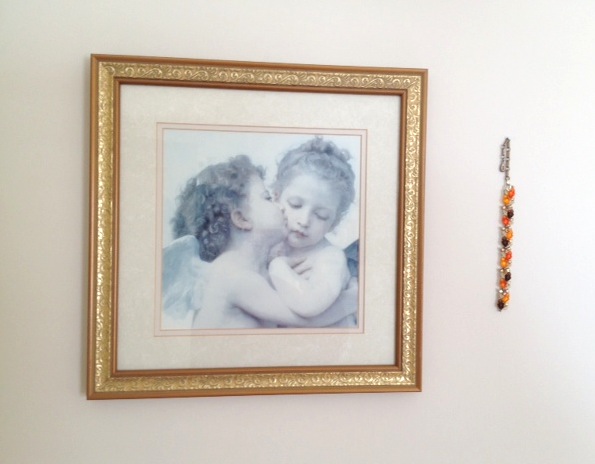
Before the splurge, there was an angel print, accompanied by a broken vintage bracelet…

Angel print with braceletThe splurge was spending $40 on a custom-printed Lumineers poster on Etsy…

Lumineers 2
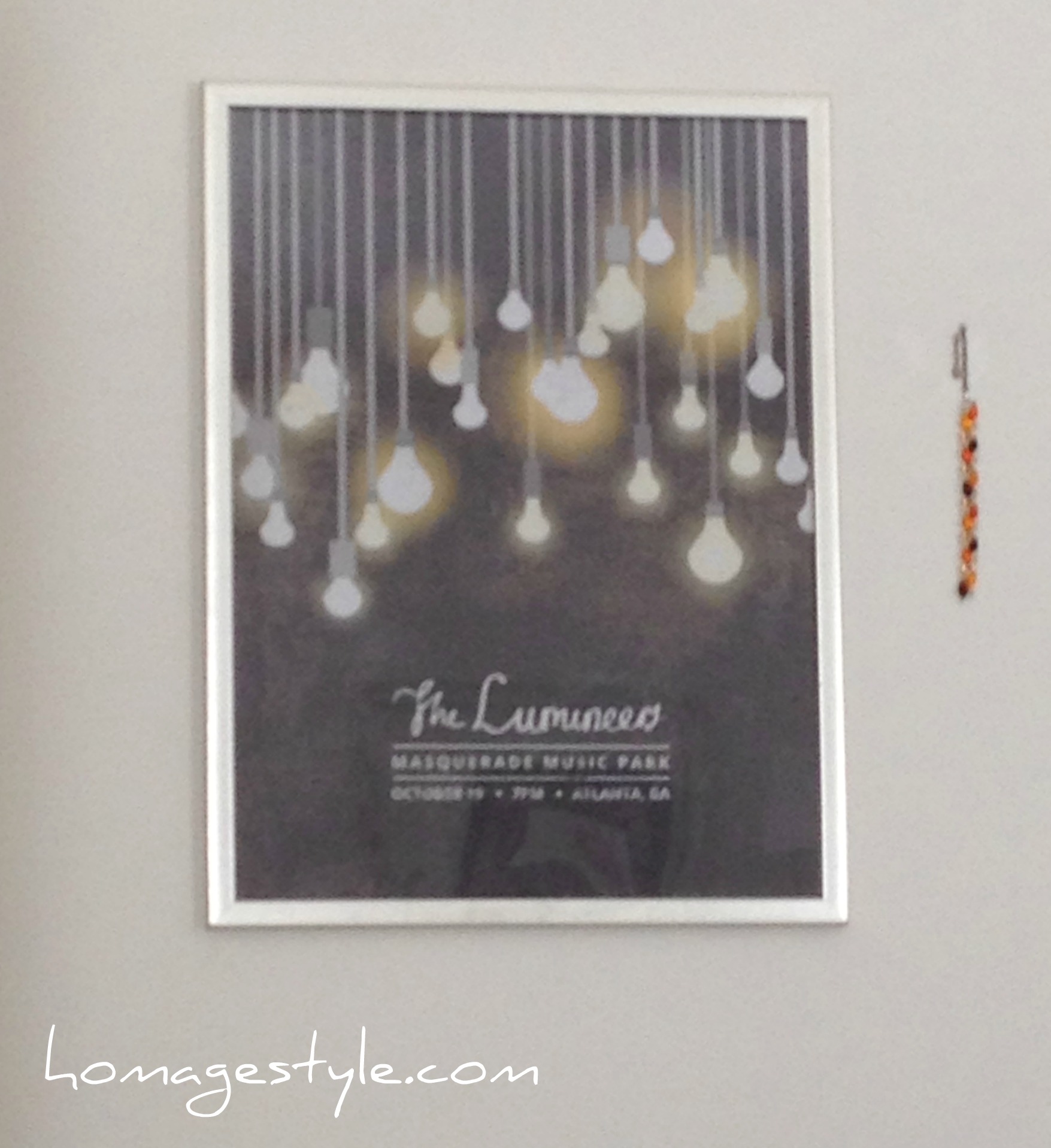
I love the Lumineers and I superlove the poster art! The perfect mod piece to start the sexy love affair with vintage and shabby chic.

Sadly, I won’t be sharing the artist info here, because it took over a month and opening a case on Etsy to finally get the seller to ship, despite having paid. But at least I finally received it and I’m in love!

I tossed it into a basic poster frame and voila! Here it is from another wacky angle…

Lumineers 1
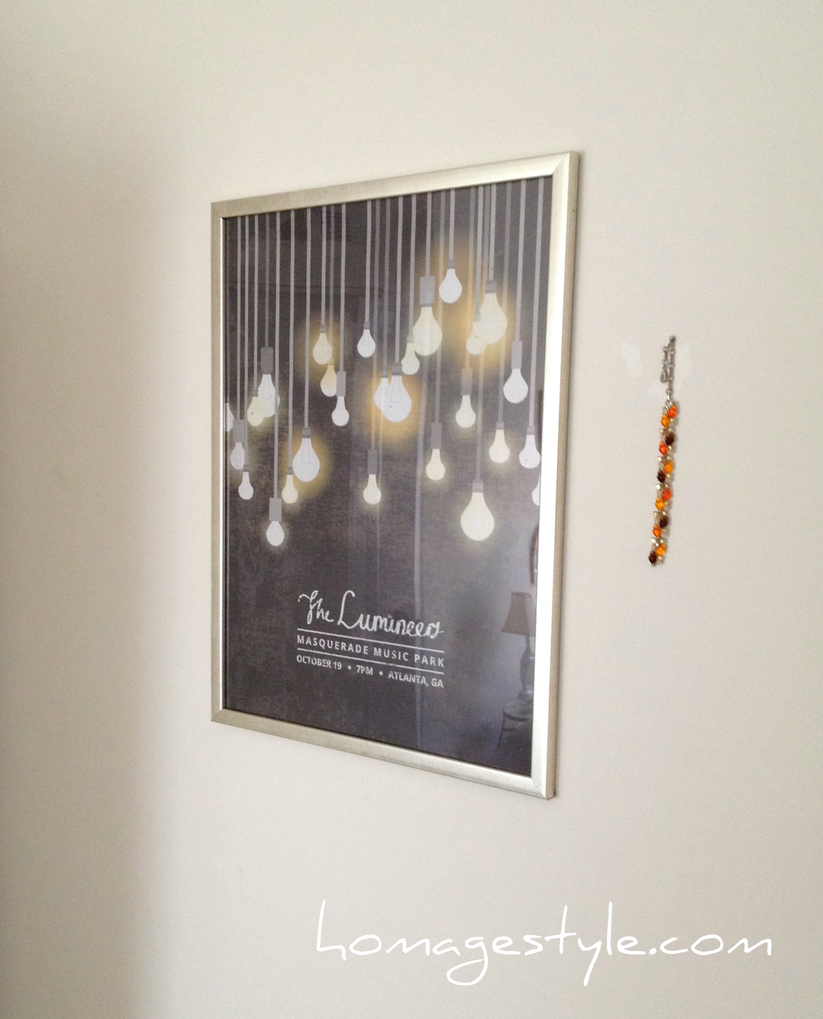
And you can see the vintage bracelet remained.

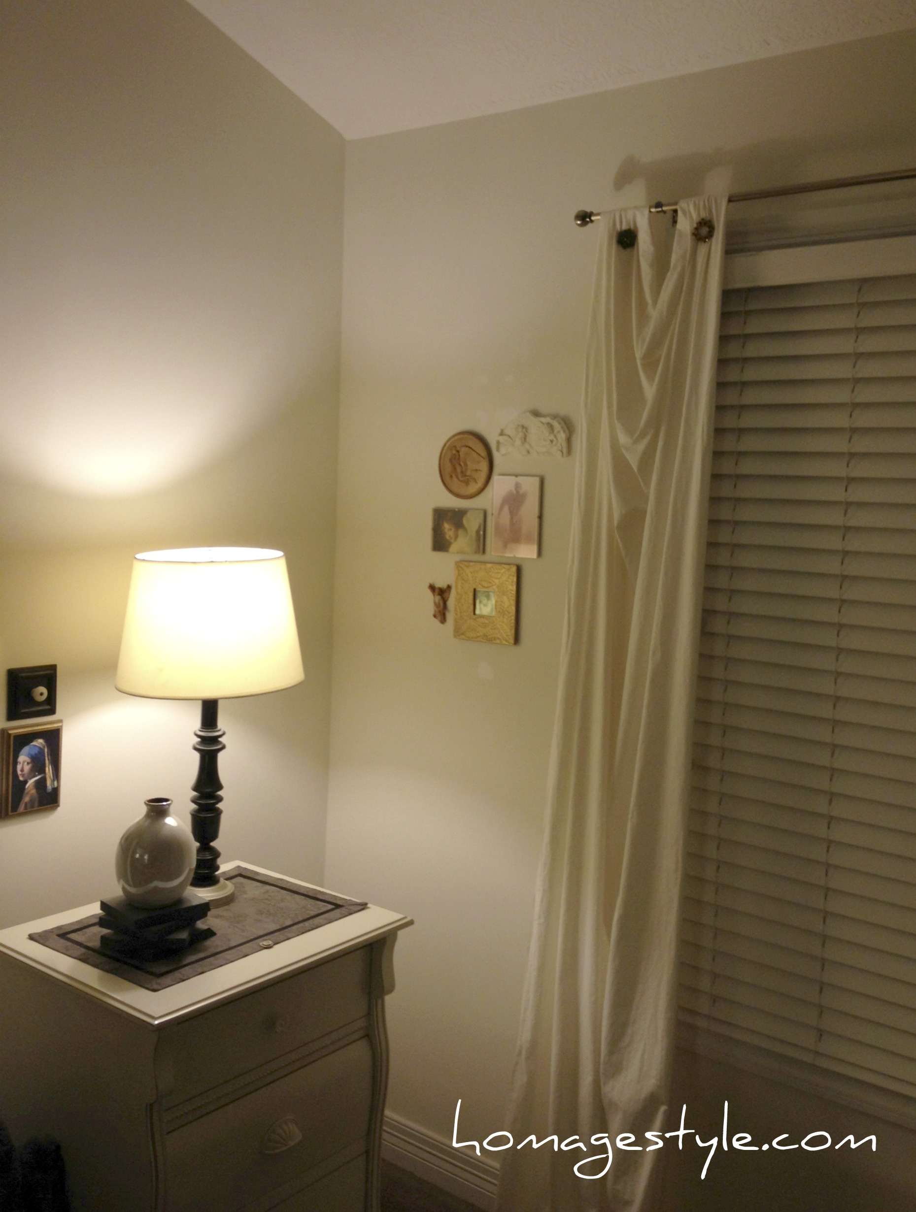
To the left of my bed I tightened up the placement of the pieces that were already hanging on that wall, to give them more of a vignette feel…

frame artAnd on the right side of my bed I added a gorgeous mermaid print I bought a while back on Etsy from artist Amy Huddleston. (You know the drill…it was curing for a while.) I placed it in a mod white frame, which really brought an eclectic feel to the grouping. Talk about mod and vintage and shabby chic!

eclectic art grouping 3
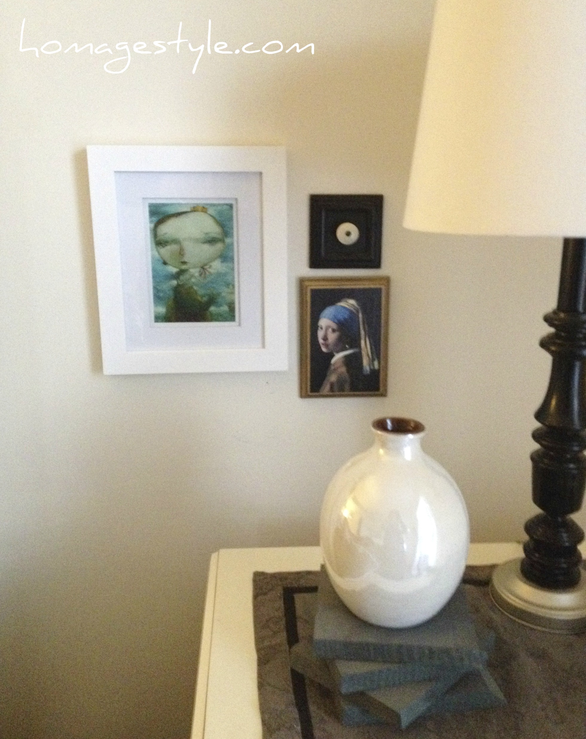
The blues and aquas and in mermaid print bring out the blue in the Girl with a Pearl Earring by Vermeer. Which, by the way, I found on the back of a Reader’s Digest magazine and decoupaged to a piece of painted wood.

But the white frame seemed too stark. Something was still missing…know what I mean?

eclectic art grouping 2
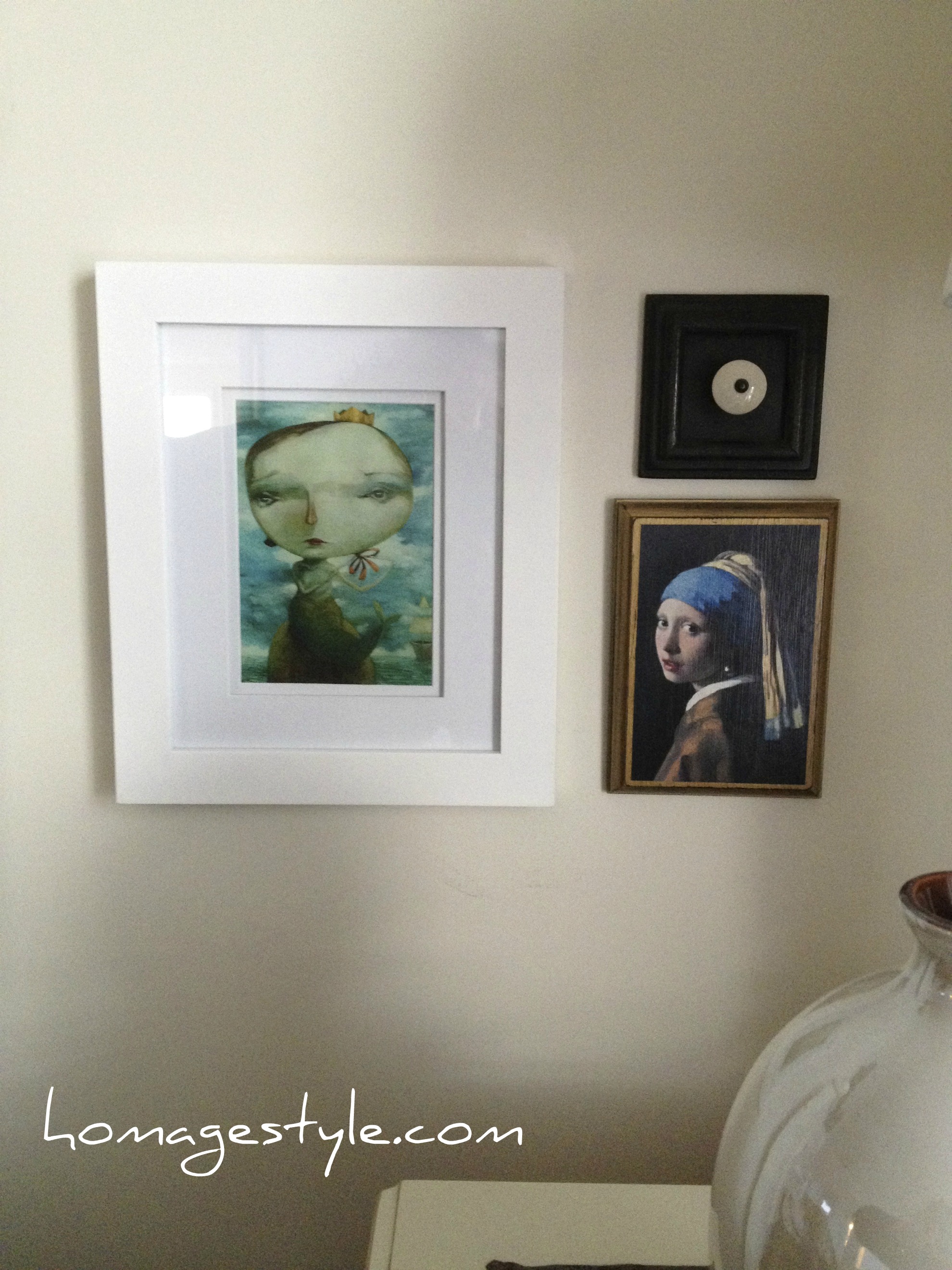
Oh yeah. Washi tape, part deux.

eclectic art group with washi tape
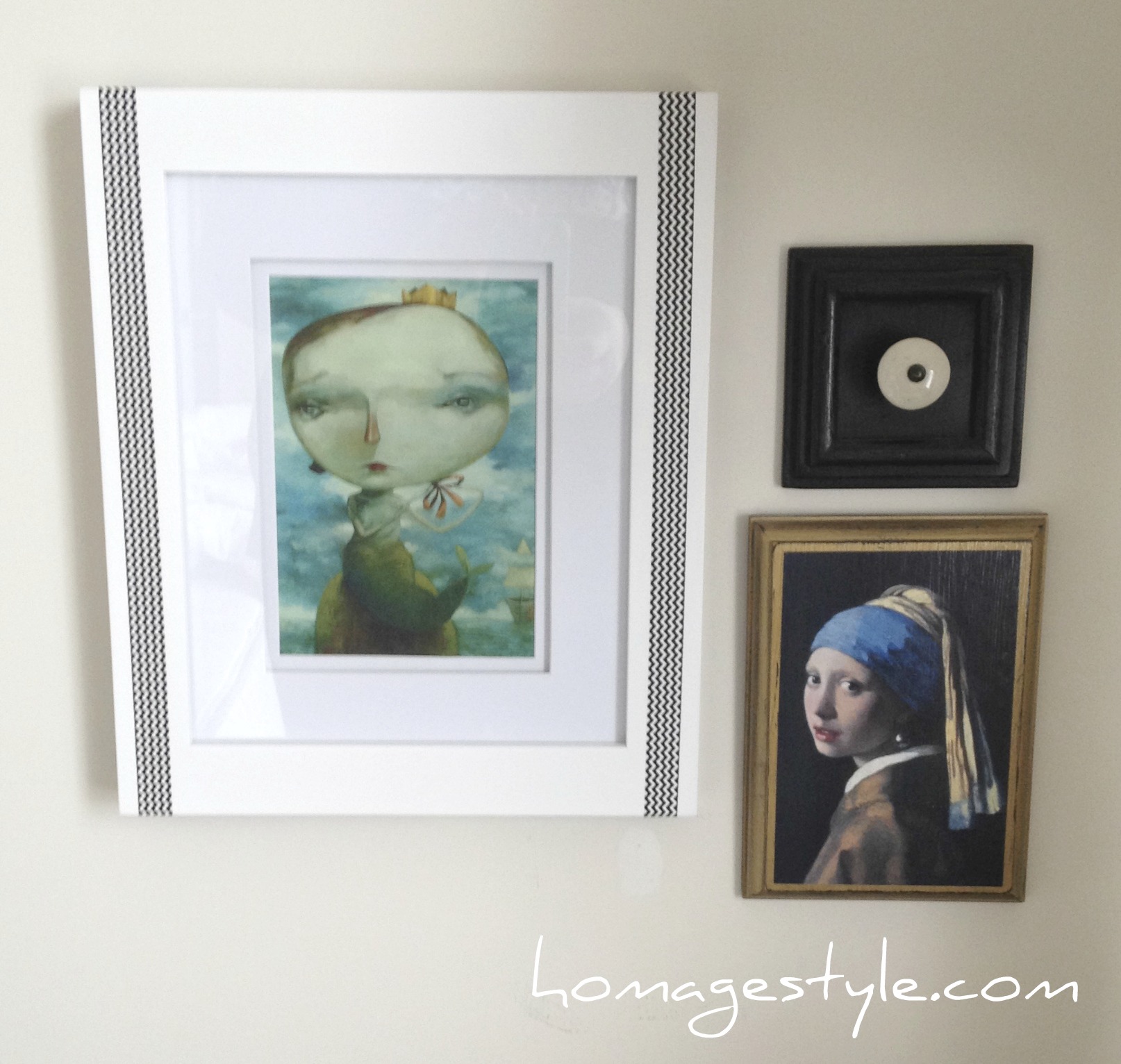
I added some black and white chevron washi tape – part of my $2.99 three-pack – and it did the trick! Toned down the starkness of the white and tied it to the black in the other two pieces. Here’s a close-up…

eclectic art with washi tape
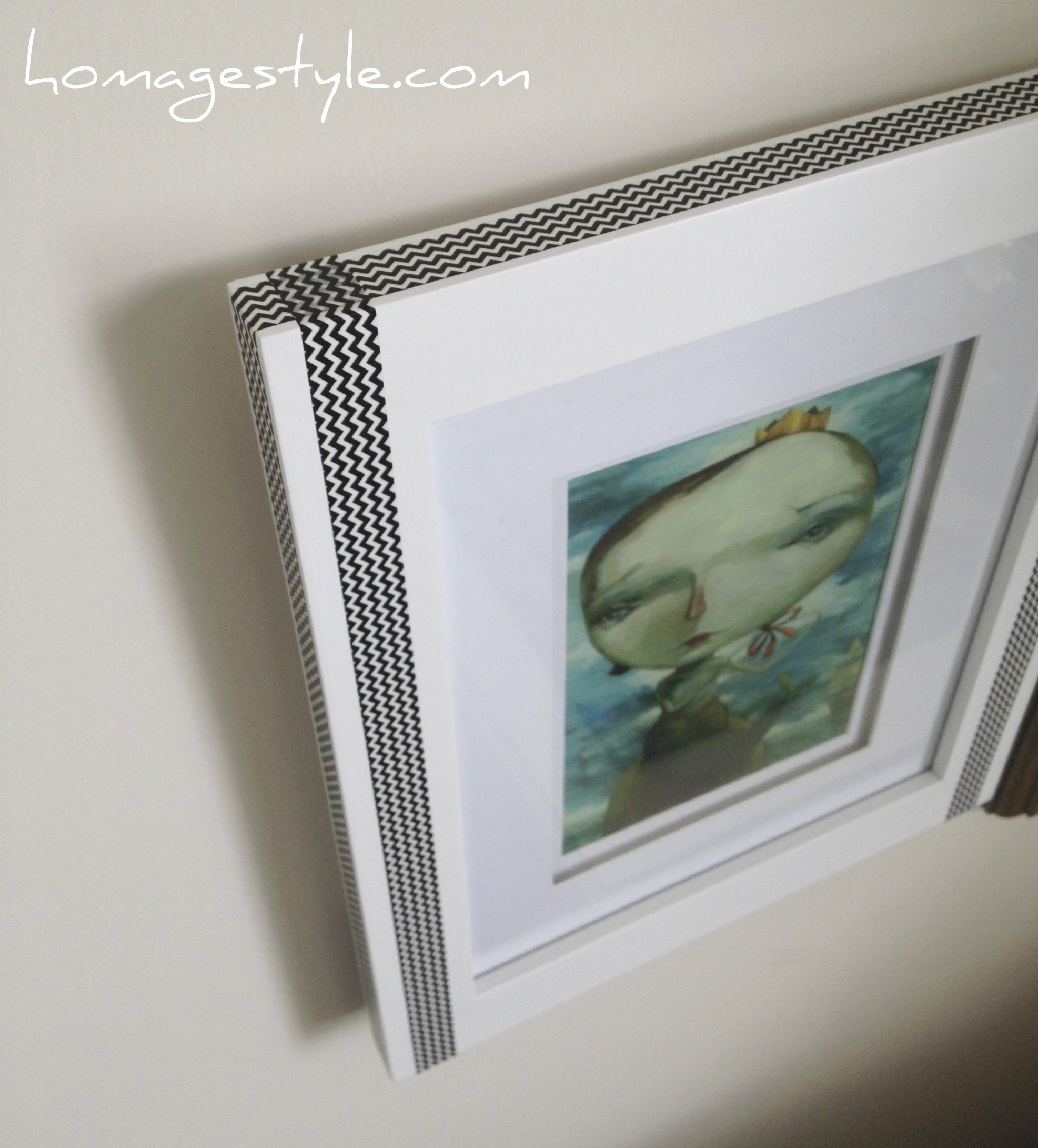
Taping perfection. Just eyeballed this as well. You could do the same, or maybe even be more precise and measure.

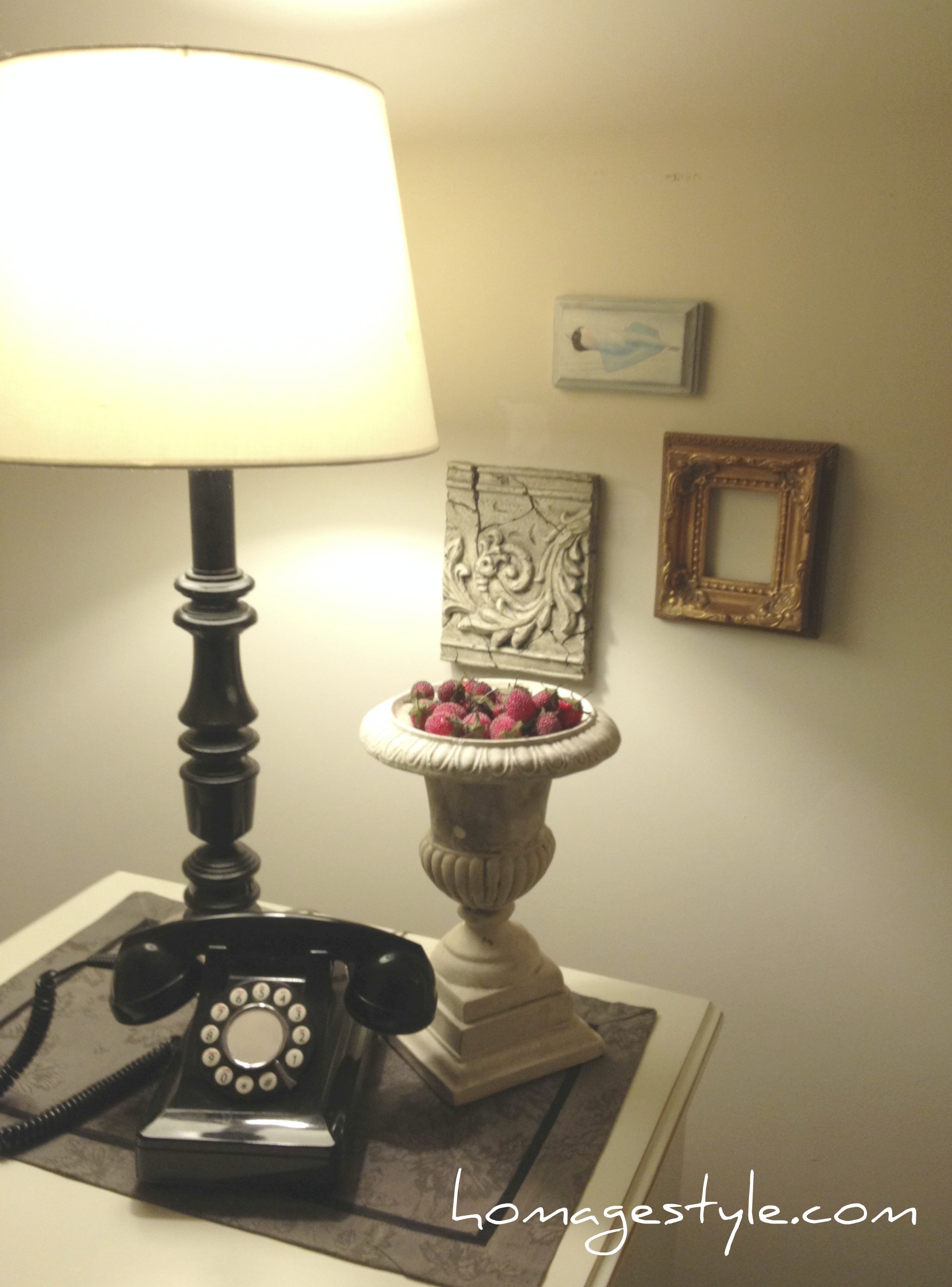
Although those are all awesome, we’re still not finished.

Previously, I had this angel art all lined up in a row…

Angel art before
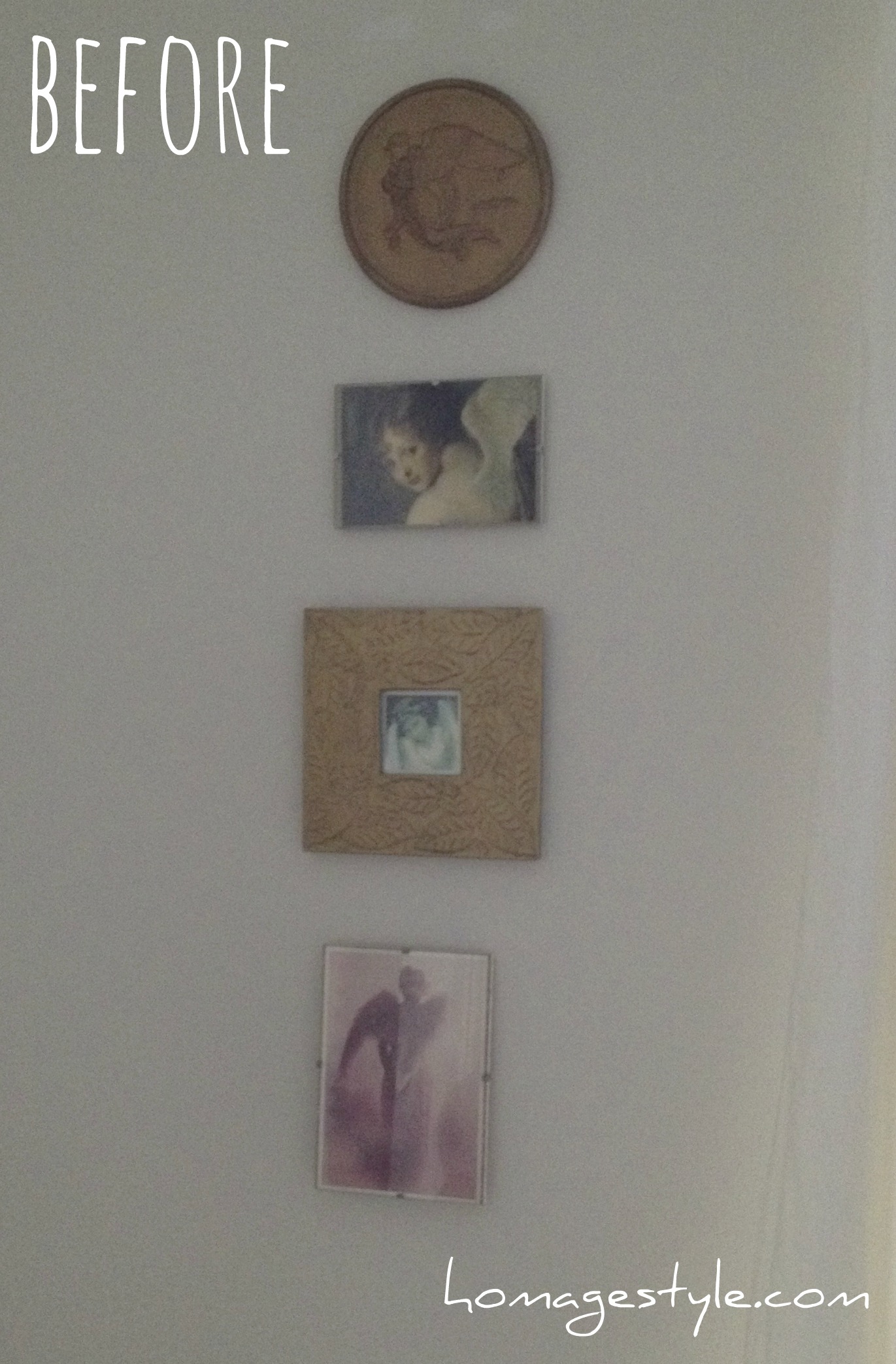
Very pristine and orderly, but where’s the flair?

I’ll tell you where the flair is…right here…

angel art groupingI mixed those bad boys up for a touch of the unexpected! We can’t be angelic and perfect all the time, especially when things have gotten boring in the bedroom!

Here’s where they are in the room…

angel art
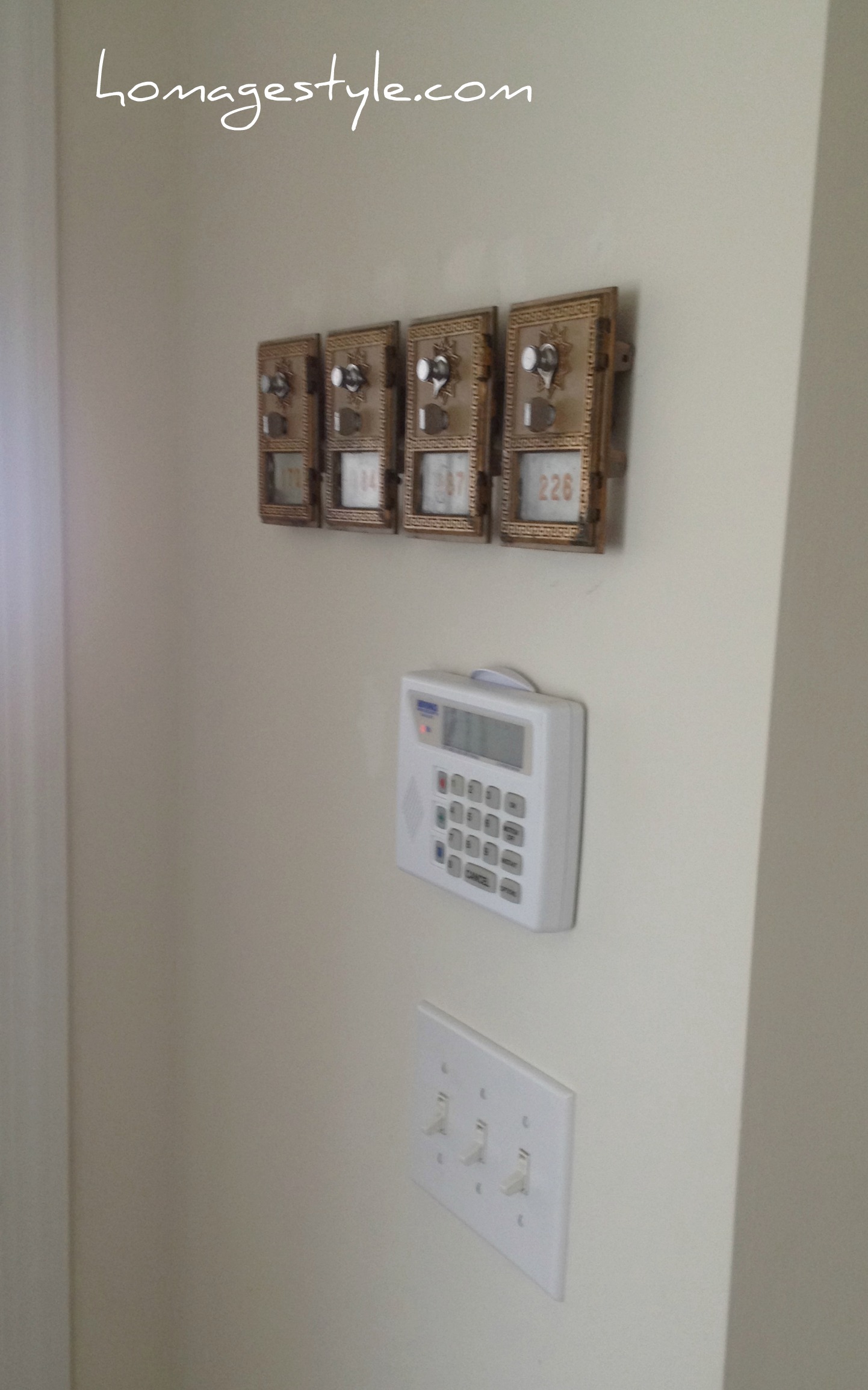
And finally, I dug deep into the world of curing and found these vintage mailbox doors that I purchased on eBay approximately 10 years ago.

mailboxes as art
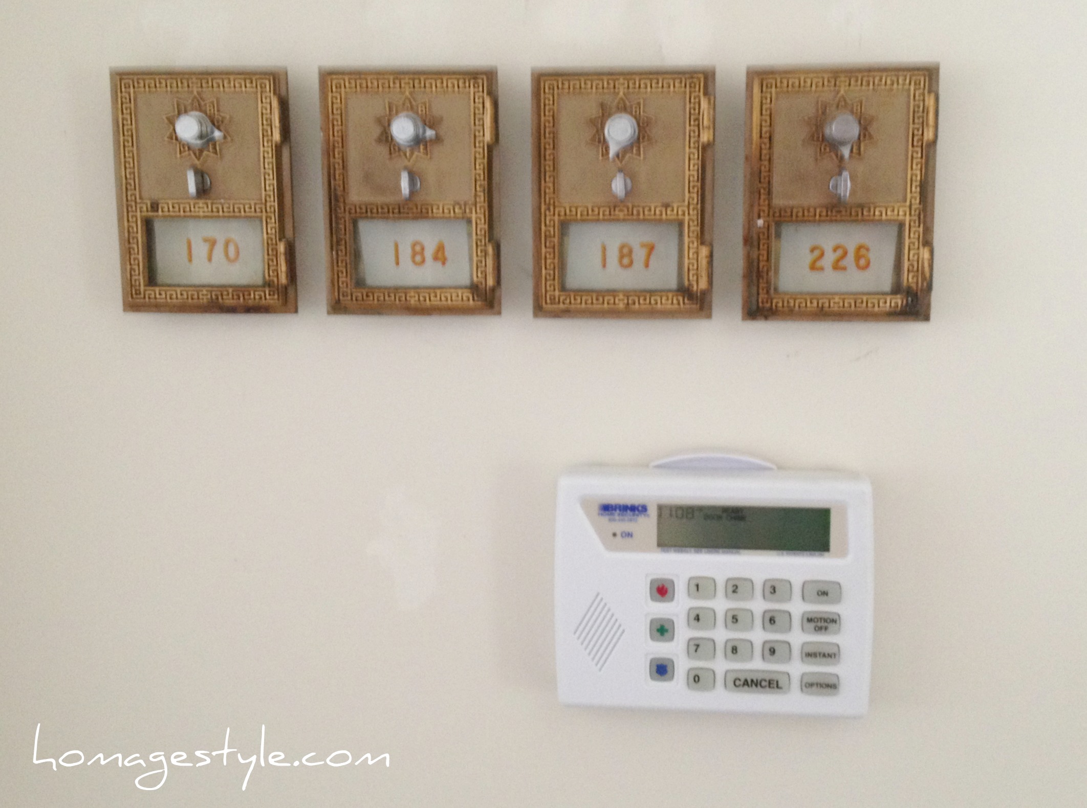
I figured that it was time to take the focus off the alarm system and the light switch – boring! – and add something interesting to this spot!

Now mind you, I did slice my finger open adding picture hanging wire to the back of these and heavily debated whether I needed a tetanus shot – I didn’t end up getting one and fortunately lockjaw has not set in – but they were certainly worth the effort!

mailboxes as art 2They just look so cool all lined up and are another metallic element, adding to the mixed metals in the room, accents of silver and gold and bronze.

A  whole new fun, updated bedroom for less than $100. Cheaper than sexy lingerie and a night out on the town! Who’s bored now?

Take my advice…don’t be afraid to mix it up in the bedroom!

design vacation :: angsty teen boy’s room

21 October 2013 by Andrea Leave a Comment

room 3

My little boy is not so little anymore.

In fact, he’s a teenager. Guess that means it’s high time for an angsty teen room.

When we last saw the boy’s room, it was a vintage cowboy room…

102_1140a

Not so cool for a teenager. So sadly it had to go.

Then it needed to cure for the requisite length of time. Here at Homage Style, we don’t just jump into projects. We think them through, allowing the creative juices to flow. Some call this procrastination. I call it the creative spirit!

Well, this past week, my son went to Washington, DC with his 8th grade class, so I decided to take some time off from my day job and revamp the boy’s room. So off I went on yet another design vacation.

My son picked his own paint color and it was deep cobalt blue from Behr. I felt that it might be a little dark and overpowering, but then again, I’m just the mom…what the hell do I know? So I let him have his paint color. Ultimately it was the perfect color to set the tone for a dark and angsty teen room.

Let’s take a look around the room, before the angsty teen boy gets home and kicks us out! Here’s the finished product…

room 2

With two windows, the room gets plenty of light, plus the black and white striped curtains from Ikea help to keep things light and fun.

At the foot of the bed are two grey beanbag chairs…

chairs 1

For the record, I don’t advocate TVs in kid’s rooms, but the boy scavenged this one, and a little dumpster diving never hurt anyone, so I let him keep it. Plus there’s no cable, so he can only play video games on it. Aren’t those beanbag chairs perfect for gaming?

In the corner above the TV is a globe lamp that I made myself from a discarded globe my sister the school teacher gave me…

globe 4

Globe lamp how-to blog post coming soon. Bet my sister’s sorry she gave up that little treasure!

On the wall next to the TV is an old laminate bookcase that I spray painted ages ago for kid #1 and it’s still going strong. Above it is a manly French memo board that I created from a wooden retail display shelf…

memo 3Ohio State fans, don’t mind the Michigan hat…he only wears it on crazy hat day!

How-to blog post for the French memo board will be coming soon too.

The memo board is my pride and joy of the entire room! I’ve been percolating on this idea for quite some time now and was thrilled with how it turned out!

memo 9

A closer look…

memo 12

The wall opposite the window has some great features as well, like the floor-to-ceiling bulletin board made of 12″x 12″ cork tiles…

bulletin board 2

Isn’t that fun? Right now there’s a synthesizer in front of it, but I’m sure it won’t be long before it’s covered with all sorts of memorabilia.

bulletin board 1

Notice the You Are Awesome poster that I made last year at a letterpress printing class I took with some girlfriends. Plus there’s the lava lamp…isn’t that a requirement for every angsty teen room?

lava lamp 1

And the black and white striped canvas balances out the black and white curtains on the other side of the room and breaks up all that blue. It was super easy and cheap to make…just painted the canvas white, then taped off for the black stripes, painted the black stripes, and voila!

bulletin board 3

We’ve all heard the saying, the best things in life are free. Well, this is especially true for free art! It’s the best!

I was lucky enough to score some advertising art posters from work and was thrilled that they were the perfect colors and style for the boy’s room. And by score, I mean co-opt them after someone left the company and left these bad boys behind. The first is a cool clown placed to the left of the window…

clown 1

And the other is a giant robot towering above the headboard…

bed 1

To the left of the robot poster is a Serbian ethnic instrument, a tambura, which the boy occasionally tries his hand at. It, along with the wooden French memo board and the cork board, as well as the natural wood on the furniture and the wooden box on the nightstand add an earthier touch to what could otherwise be a too cold blue room. All the beautiful wood tones warm up the room while giving it a very masculine touch.

I was really happy with the way the room turned out, but was especially thrilled when the boy came home and said he LOVED his new room! I’d call that a successful design vacation!

room 1

tea time

15 January 2013 by Andrea Leave a Comment

Would you please pour me a cup of tea?

Tea pot 1

Oh wait. Something’s off. Looks like someone put Sharpies in the teapot.

Oh yeah. That was me. Because I love to use things for purposes other than their original intent. Like Sharpies in a funky Midsummer Night’s Dream teapot.

Clever, too, since I wasn’t serving up tea very often.

tea pot 2


It’s cute, don’t you think?


little things :: recorder edition

5 September 2012 by Andrea Leave a Comment

If you have kids or ever were a kid, I’m betting that you have an old recorder lying around. Didn’t everyone play recorder in school? I know I did, my sister did, and both of my kids did.

And I’m guessing that you also have some weird little strip of wall that is too small for just about anything decorative. Well, guess again, people!

Dig up that old recorder make it sing again!

No, you don’t have to play Lightly Row…just find an awkward spot and hang that recorder up, just like this…

It’s just a tiny little speck of wall between two door frames. Perfect for a recorder! Don’t you think?

How much did it cost? $0, since I had not one but two recorders hanging around. And if you want to get all funky and colorful, you could spend about $5 and get one of these…

Now go play Lightly Row while you’re looking for a place to hang your recorder!

choosing an accent color

26 August 2012 by Andrea Leave a Comment

Recently I freshened up my family room by adding some simple accessories and not spending scads of money. My new accent colors are orange, yellow, and a vibrant green.

I chose those colors by taking a look at some of the accessories I already had in the room (that I knew I’d be keeping) and picking out some of the more vibrant colors, like the orange and yellow in this lamp shade (which has a great story behind it)…

The spicy pumpkin orange and greens in this chair…

The golden lamp…

The yellow in this vintage advertising art…

And the vibrant yellow lemon zest in the poodle’s martini…(and what poodle doesn’t deserve – hell, even demand – a martini?)…

All pieces that I already had in my family room that either I love (the art and the striped lampshade) or that need to stay because the lotto fairies didn’t leave me a winning ticket (the 90s chairs). Bottom line…I built an entirely new look based on what I already had with just a couple of colors that are now here…

and here…

Plus, just to keep everyone on their toes with a little design surprise, I didn’t just stick to orange, yellow, and green, but also added in a little zebra and black and white…

…because doesn’t black and white zebra match just about anything? Just shake your head yes and agree with me and no one will get hurt!

See it all pulled together in the family room here.

little things :: work cubicle edition

10 March 2012 by Andrea Leave a Comment

For those of us who work full time outside the home, we spend more waking hours there than in the homes we love with the family we love.

OK, now that I’ve depressed you, let me at least encourage you to do something to spruce up your cubicle space.

Nothing as extravagant as you’ll find here…

Maybe something a little more subtle…

One of the ways to soften the harsh edges of a cubicle and give your workspace some life is with a plant. Here’s a plant that I’ve had at my desk…

Just your basic succulent.  (I can’t handle plants that need any more care than very infrequent watering, hence the succulent.)

Then one day we were cleaning out our supply of old versions of dictionaries and style manuals.  I work as an editor, so we need to work with the most up-to-date versions. The books were going to be tossed in the recycle bin, so I decided to give them new life and add some height to my plant…

Use what you have decorating at its finest! Now it’s just a little thing, but it’s really spruced up my plant and my desk!  You can add a little design just about anywhere with a stack of books.  And no need to pay lots of cash for this one…check out the dumpster, the recycle bin, your bookshelf, or the library book sale.

Here are a couple of other tchotchkes that I use to personalize my cubicle space…

Because I love me some letters and numbers, I *had* to own this lamp when I saw it on clearance at Kohl’s a couple years back.

And this sweet thing from my monkey collection…

Just a couple of things to make my cubicle to seem less sterile and more fun!

Have you done anything fun to brighten up your workplace?  Share your pics on the Homage Style Facebook page.

And don’t forget to enter the Spring Cleaning Giveaway for a chance to win this adorable sterling silver charm bracelet!

Click here for contest entry details.

Showing off at…

design vacation :: project break :: shabby chic meets mod lamps

23 February 2012 by Andrea 1 Comment

I’m on vacation this week, and spending some time cleaning and freshening up a couple of rooms.  I’ve been hacking away at my master bedroom, slowly but surely.

The look that I’m going for in my master bedroom is shabby chic meets mod. I’ve already got the shabby chic going on, and a couple of mod elements, but felt that these lamps were a little too ornate for the look I’m after…

The one on the right can be seen here in these keeping it real pics from the master bedroom…

Sorry, no before pic of the other lamp.

I decided to spray paint both lamps a glossy white.  Simple enough.  I figured it should be a quick and easy sprucing up. Maybe an hour max. Of course even thinking that was the kiss of death that guaranteed I’d have some sort of problem! Guess I forgot the basic physics formula of any DIY project…project time and difficulty is inversely proportionate to the number of times DIYer says or thinks it will be a quick and easy slam dunk!

Here are they lamps after the first coat or so…

I happened to notice that the lamp on the left was having a little bit of an adhesion issue…

The paint just wasn’t sticking on the neck of the lamp.  What the heck? So I continued spraying. I would conquer this lamp with cheap spray paint.

No improvement. Maybe it was the cheap spray paint.  Maybe it was because I didn’t wait long enough between coats. Or maybe there was some sort of texture or oil base or who knows what.  The other lamp, however, was shaping up quite nicely.

I had a can of Krylon Fusion for Plastic in white, so I decided to give that a try, since it’s supposed to stick to just about anything.  That began to work.

After I got the neck of the lamp fixed up with the Krylon, I sprayed the entire lamp with a couple more coats of glossy white. Finally, success!

Here’s the lamp that didn’t give me too much trouble, on a terrific inlaid shell table that I scored a couple years back at the end of summer for $20…

And here’s the problem child, that turned out great in the end…

Perhaps you’re wondering, why white? It’s all going toward my evil plan of eventually painting the walls a rich gray.  Just imagine how beautifully the furniture and accessories will pop against a deep gray backdrop.  Can’t wait to get to the painting phase of the journey.

A fun, eclectic collection of goodies that makes my shabby chic meets mod dream come alive.

And don’t forget to enter the Spring Cleaning Giveaway for a chance to win this adorable sterling silver charm bracelet!

Click here for contest entry details.

Showing off at these link parties…

Remodelaholic

design vacation – project break :: the letter a

22 February 2012 by Andrea 3 Comments

In the midst of my craft armoire declutter yesterday, inspiration struck, so I decided to go with the flow and create a little something.

I started with a canvas that I had painted in black & white stripes for a previously failed project.

In my decluttering, I came across an old atlas that I was saving for a moment like this. My son has an collection of letter As, since his name starts with A, so I had the idea of making a letter A with the map of Ohio, since we live in suburban Columbus, Ohio.

Here’s the Ohio page…

The Columbus area is a lighter color, which will make the perfect center of a lower case A.

A lesser person might actually print out a letter A in their font of choice and trace it onto the map.  I decided to create a more imperfect freehand version…

Then I adhered the letter to the painted canvas using rubber cement, which will create a good hold and will allow both the paper and the canvas to remain smooth.

All that was left was to add it to my son’s collection…

Done deal! Perfect addition to his collection, and since the canvas had already been painted, the project only took about 20 minutes.

And don’t forget to enter the Spring Cleaning Giveaway for a chance to win this adorable sterling silver charm bracelet!

Click here for contest entry details.

Showing off at these link parties…

Remodelaholic

design vacation – keeping it real in the master bedroom

20 February 2012 by Andrea 5 Comments

Sounds kind of scandalous!  But when you see this, you’ll realize how completely scandalous it really is…

Messy-licious! And there’s more…

Nothing like watching an episode of Hoarders to jump start the spring cleaning bug.

And that, my friends, is my bedroom.  Let’s just say it’s gotten out of hand. So I started with a big cleanup. Which took a surprisingly long time. I’m sure that had nothing to do with treating myself to occasional trips to Pinterest.

While it’s not quite ready for the full reveal, here’s a little something…

Nothing wrong with this vignette, but I’ve been trying to add a touch of mod around the house, so I want to mix it up a bit.

I found a terrific iridescent vase at Target, and it looks pretty good…

…but it could use a little more height.  Something along these lines…

These are pieces of wood that my son broke when he was in tae kwon do. But the raw wood looks too, well, raw, so I painted it with a gray craft paint, not worrying about priming or if the woodgrain showed through the paint.  Call it character and texture.

There, that’s better. The painted wood adds height and texture.  Plus the wood pieces have special meaning to me, and now I’m using them instead of having them stuck in a cabinet.  My son even wrote his name on one pieces, making it extra special.

Plus it looks great, don’t you think?

Don’t forget to enter the Spring Cleaning Giveaway!

Showing off at these link parties…

Remodelaholic

ottoman before & after

8 January 2012 by Andrea 11 Comments

About a year ago, I found this ottoman in my neighbor’s trash…

It was in pretty bad shape, but sturdy nonetheless…

Obviously trash picked, since there was even garbage in the springs…

Gross, but salvagable!

So, I let it cure in my garage for a year.

Eventually I picked up some zebra faux fur, which I bought from Joann, using a 50% off coupon from the Joann app on my iPhone. I bought a yard and a half, which cost me around $12 with the coupon.

This weekend the moment of inspiration finally struck!

I already had high gloss black spray paint, so I cleaned up the ottoman and spray painted the legs.

I didn’t worry a whole lot about getting paint on the original fabric, since the faux fur is thick enough to cover any discoloration.

The legs weren’t looking too bad…

It’s amazing how much of a difference just the black paint makes.

And now for the faux fur…

I began by stapling the prewashed fabric in the middle of the wider side of the ottoman.

As an aside, if you’re in the market for a staple gun, let me recommend that you consider an electric staple gun.  They’re just a couple bucks more than a manual one, and totally worth it, because the electric one won’t kill your hands the way a manual one does. It’s still a workout and you’ll still break a sweat, because you need to press firmly to release the safety and you’ll need to pull the fabric taut as well. But overall, it’s much easier to use.

After stapling several places in the middle, I stretched the fabric taut and stapled similarly on the opposite side.

I stapled my way out from the middle, and then did the same on the shorter sides of the ottoman, working my way to the corners.

When I got to the corners, I folded them like I was wrapping a present, tucking them in and under as flat and tight as possible.

So that it looked like this on the side after stapling…

And like this underneath…

I wasn’t terribly concerned about how things looked underneath, just as long as it looked good on the visible surface. And I think it turned out looking pretty darn good!

Isn’t it adorable?  I love it!

Best of all, it was a super inexpensive project.  Only cost me $12 for the fabric, plus the spray paint I already had on hand (approx. $4), and my time an effort.  Can’t beat that!

I’m not sure if I’ll keep the ottoman with the red and orange chair, since they’re both pretty bold, but the combination is growing on me, and boy do I love the zebra faux fur ottoman!

Would you keep the chair and the ottoman together?

Showing off my new ottoman at Funky Junk Interiors and Kammy’s Korner. And jumping into the contest over here…


Next Page »
  • Email
  • Facebook
  • Instagram
  • Pinterest
  • Twitter

subscribe, baby!

Homage Style on Twitter
Homage Style on Facebook
Pin me! Homage Style on Pinterest

archives

WORK IN PROGRESS...

work in progress :: rose painting

FAVORITE PROJECTS...

the tornado lounge

another glorious chalkboard project

freshening up the family room

industrial chic curtains

angsty teen boy's room

almost instant art

vintage cowboy room

Copyright © 2025 · Beautiful Pro Theme on Genesis Framework · WordPress · Log in