homage style

when your home is your canvas

schedule a design consult
  • blog
  • services
    • styling & decorating
    • home staging
    • virtual home staging
  • featured
  • about
  • workshops
  • contact
  • subscribe

choosing an accent color

26 August 2012 by Andrea Leave a Comment

Recently I freshened up my family room by adding some simple accessories and not spending scads of money. My new accent colors are orange, yellow, and a vibrant green.

I chose those colors by taking a look at some of the accessories I already had in the room (that I knew I’d be keeping) and picking out some of the more vibrant colors, like the orange and yellow in this lamp shade (which has a great story behind it)…

The spicy pumpkin orange and greens in this chair…

The golden lamp…

The yellow in this vintage advertising art…

And the vibrant yellow lemon zest in the poodle’s martini…(and what poodle doesn’t deserve – hell, even demand – a martini?)…

All pieces that I already had in my family room that either I love (the art and the striped lampshade) or that need to stay because the lotto fairies didn’t leave me a winning ticket (the 90s chairs). Bottom line…I built an entirely new look based on what I already had with just a couple of colors that are now here…
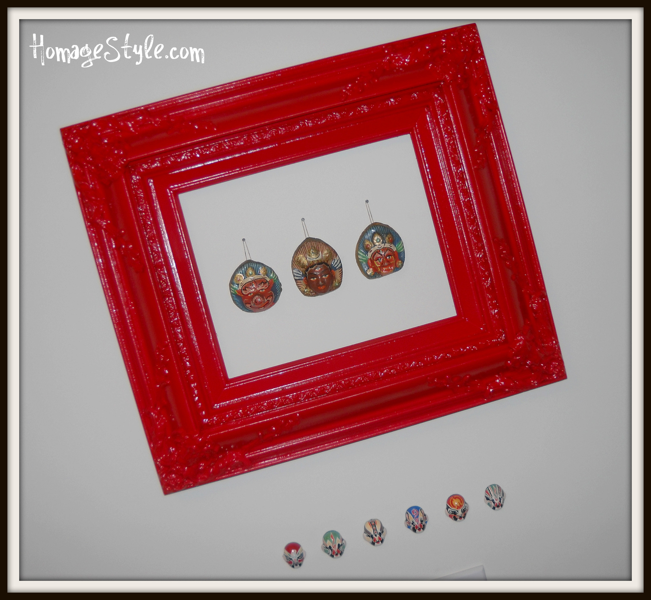
and here…

Plus, just to keep everyone on their toes with a little design surprise, I didn’t just stick to orange, yellow, and green, but also added in a little zebra and black and white…

…because doesn’t black and white zebra match just about anything? Just shake your head yes and agree with me and no one will get hurt!

See it all pulled together in the family room here.

clockwork orange

26 March 2012 by Andrea 1 Comment

Or…

How I Realized That I Would Be Crazy to Paint My Wall Orange

I had this brilliant idea that I would paint an orange rose, something along this lines of this…

…on a giant canvas and hang it on this gray stairwell wall…

…which would be great, because I’m planning to use orange as an accent color in my family room, and it would all tie together seamlessly.

Then I got the brilliant idea that I could paint a small section of the wall orange to the left of the gray wall. Seemed like a great idea in my mind. (That’s foreshadowing, folks…)

Since I was only going to paint about a 5-foot section, I thought about just buying a quart of paint and going for it. But then I thought better of it when I wasn’t certain which orange to choose, so I brought home a couple of paint chips and taped them to the wall like I always do…

…which is a good thing, because I realized that I hated all of them and I don’t think that orange is a color that I can live with, at least not on an entire wall. Didn’t like a single one of them. Not the coral or macaroni and cheese variety, not tangerine, not clementine, not bold orange, none of them.

So let this be a lesson to you. (And by you, I mean me.) Always tape your paint chips to the wall to see how you like them before slathering on the paint.


the new neutral

6 October 2011 by Andrea 4 Comments

Here are a couple of paint colors that I’m considering for my bedroom…

Why yes, I am feeling a little bold, now that you mention it!

But not just bold…neutral.  Gray is the new neutral.  At least in my world.

Originally I was leaning toward a standard taupey beige. But then I saw this and this and caught the gray bug. My master bedroom is light and airy, with 2 large windows and a vaulted ceiling, so it could handle a dark color without becoming a depressing cave. Plus I have these lovely tile floors in my master bathroom with lots of gray and blue, so it will all tie together beautifully…

Gotta love my leopard slippers! No animals were harmed in the making of my slippers.

Right now I’m leaning toward #1 and #3…

#4 is way too dark, and #2 and #5 are too muddy with too much yellow.

1 = Glidden Seal Gray

2 = Martha Stewart Living Zinc

3 = Behr Pewter Ring

4 = Martha Stewart Living Magnetite

5 = Behr Suede Gray

I may still try on some other paint chips for size, plus who knows when I’ll get to this painting project, since I do have 14-foot ceilings and a case of acrophobia (fear of heights) and an empty wallet (no money to hire a less fearful painter-type).

What do you think? Would you go this bold and dark in your bedroom?


knife-wielding decorator

15 March 2011 by Andrea 4 Comments

Slowly but surely, I’ve been trying to add pops of color and a touch of mod to our family room.

Today, I happened to wander into Pier 1 Imports on my lunch hour.  Always dangerous.  Fortunately I got out of there with only minor expenditures!

I found 2 of these fun candles with battery-powered mini lights.

Plus, see that red clearance sticker?  Only $4.18 each!  Can’t beat the price!  And they’ll definitely add some color here…

Plus, since they’re battery operated, I won’t burn down the house!  What could be wrong with that?

Nothing.  Except they’re way too tall.  See?

Way out of proportion.  Bummer.

No worries.  Have knife, will decorate!

Even though they’re battery powered, the candles are still wax.  So I figured that if I took a sharp knife to them, I could cut them down to a better size.

Well, it didn’t cut quite as perfectly as I had hoped, but I carefully cut through the other half of the candle, then trimmed it to perfection with a paring knife.

OK, now this looks better…

More proportionate, and the colors are even bolder without as much white at the top.

Looks nice “lit”…

A colorful improvement!

Check back soon for more family room updates!

Showing off this project at the link party at Funky Junk Interiors.

robin’s egg blue

12 September 2010 by Andrea 3 Comments

Robin’s egg blue.  Sky blue.  Tiffany box blue.  I love all of those gorgeous blue hues.  But there aren’t really any rooms in my home where an entirely blue room would work well.  So I decided to create a little vignette at the bottom of the stairs that isn’t really part of any room, but the perfect place for a splash of robin’s egg blue.

And because I have a bird problem, when I think about robin’s egg blue, I start getting all literal, thinking about eggs and nests and feathers and birdhouses and branches…need I say more?  I’ll just show you…

I decided to create a vignette that brought a bit of the outdoors in.  Most of the items in the vignette I already owned.  Only had to purchase the nest, eggs, and feather, so this whole arrangement cost me less than $5.

This small square glass plate is from my old house, where I used it as a candle dish on the mantel.  I think it set me back a whopping $1.99 at Home Goods.

Then there’s this gorgeous blue & black floral bowl.  Another inexpensive Home Goods find.

My favorite part of the vignette is the nest with eggs, and the branch with a feather.  I simply hot glued the eggs into the nest, then tied a little floral wire on the back of the nest so I could hang it on a nail.

When I got the bug to do this project and needed a tree branch, I took a walk on the path that goes around our neighborhood, which backs up to a tree-lined corn field.  Whenever I ride my bike along the path, I have to dodge fallen branches, so I figured I’d find something good there, and I wasn’t disappointed.  I hammered some nails strategically at the joints of the branches, so I wouldn’t have to nail through the branch itself, and risk splitting it.

To give the illusion of a bird, I used a colorful feather, which is actually a Christmas ornament, tucked behind the branch.  Who would decorate their Christmas tree with bird feathers?  Me!  Guilty as charged!

Rather than try to hide the thermostat, I just incorporated it into the vignette, and it more or less becomes unnoticeable.

On the little black table sits a metal candy dish with a bird perched on it, a picture frame, and the lid from a china teapot.  Yes, that still is the fake photo in the frame from when I first bought it, even though I’ve had it for a solid 4 years!  Eventually I’ll get around to finding just the right photo!

The teapot lid has a story to it as well.  Someone – a child or pet, but I can’t quite recall – accidentally sent the whole thing flying across the room on a collision course with a tile floor, and I had to piece together the lid with ceramic glue…now that was a project!  But I loved it so much, I couldn’t bear to call it a loss and toss it in the trash.  It lives again in this fun vignette, full of robin’s egg blue.

Do you have something in your home that’s inspired by good ole’ Ruby Redbreast?

PS…this post was inspired by Donna over at Funky Junk Interiors…she’s having a Robin’s Egg Blue link party, so check it out!

Funky Junk's Saturday Nite Special

when you said to frame it, is this what you meant?

17 August 2010 by Andrea 1 Comment

Recently, a dear friend who lives in New York came to visit me in Ohio.

After his visit, because I have a collection of masks like this…

And this…

He sent me these…

He suggested that I frame them, which I thought was a wonderful idea.  So I purchased this framed painting from a second hand store…

I paid $7.50 for it, which is more than I usually pay for something like this.  Free is usually more my price range, but I was motivated and had an idea of exactly what I wanted to do, and this was the perfect frame.  And although the painting was cute in a kitschy kind of way and very tempting to keep, I popped the painting out of the frame and began prepping to paint the frame.

So, it went from this…

To this, which resembles something from a bloody horror flick…

To this, which turned out to be cute & funky, adding a pop of color & fun to a classic office…

A close up of the detail on the frame…

What room in your home could use a shot of color & fun?

Showing off this project at Funky Junk Interiors…

Funky Junk's Sat Nite Special

let’s hear it for white walls

28 April 2007 by Andrea Leave a Comment

After several posts about the virtue of diving into a house full of colors, I must confess that I live in a world of white!

Our home is a new build, and we’ve only been here for about 9 months, so the walls are still builder white.

And I hate it.

But…

Even though having white walls is the equivalent of store brand coffee when I can have a Starbuck’s Iced Mocha, in my opinion, it’s important to live with the house for a while before jumping into paint colors.

Often, in my experience, the house will speak to you & tell you which colors will work.

Plus, many times you may consider several different versions of a room. Waiting it out a bit gives you time to ponder & think about what will make you happiest.

For example, one of the possibilities that I’ve considered for my kitchen is to paint one full wall with black chalkboard paint. When I came up with the idea, I was thrilled, and almost ran out to Lowe’s that minute.

Good thing I waited…

Upon reflection, I realized that painting an entire wall would mean lots of chalk graffiti by the kids, which, in turn, would mean lots of chalk dust, and I’m not the world’s most stellar housekeeper. I’d have to stay after school every day to wash the board!

Then I also realized that the real reason for painting the wall as a chalkboard – to create “message central” wouldn’t work either, because the wall is primarily in the dining area, not the cooking area, which is where I need my “message central.”

Waiting also helps to reinforce that your original plan is the one you want.

For example, I plan to paint my guest bathroom a deep brown, with a hint of blue & maroon. I’ve had several paint chips taped to the wall for months now, and even though it’s a very dark color for a small room, it’s the color I love & keep coming back to.

So, take your time & let the walls and rooms speak to you.

how color affects your world

27 April 2007 by Andrea Leave a Comment

Color has a powerful effect on human beings. Science has even proved this to be true. Here is how color affects your world.

Black

Black is a powerful, classic color. When used with another color, such as white, salmon, or teal green, black creates a sense of heightened drama and contrast.

Blue

Blue, the color of the sky and the sea, is a cool, serene color, known to lower blood pressure and pulse rates. Blue is a traditional, conservative color that emanates dignity and harmony.

Brown

Brown, a comfortable, earthly color, is solid and warm, inviting thoughts of things from natural, such as clay, wood, or leather.

Gray

Gray is a soothing, dignified color that can establish a calm feeling in a room.

Green

A restful, soothing color, green is refreshing, as well as tranquil. Green, a familiar color that surrounds us in nature, can bring a freshness to an otherwise plain room.

Orange

Orange is a warm, yet intense hue that is known to stimulate the appetite. Although orange is an energetic color, it is usually too aggressive for an entire room and should be used as an accent color or in a toned down form, such as peach.

Pink

A youthful and romantic color, pink conveys happiness and is know for its calming qualities.

Purple

Purple, a luxurious, sensual color, has been associated with royalty and dignity throughout the ages. Purple is a great backdrop for family areas of a home.

Red

Red is an energetic color associated with passion and excitement. This warm, strong color can raise your blood pressure, pulse rate, and your body temperature! Red is even said to stimulate conversation and the appetite, which makes it an ideal color for your dining room.

White

White is a classic color that lends a bright, open, and airy look to any room.

Yellow

An upbeat, happy color, yellow radiates warmth and optimism. Yellow is known to speed your metabolism and is thought to enhance memory and concentration. This strong, bright color is best used sparingly or as an accent color.

taking a risk with color

27 April 2007 by Andrea Leave a Comment

Be brave with color!

Dare to choose a shade other than white or off-white. After all, if you don’t like it, you can easily and inexpensively change the color, simply by repainting!

If you can’t bear to paint an entire room, add color to at least one wall. You may find that you enjoy the effect and may soon paint the rest of the room, and after that, you may go on a painting spree throughout your entire home!

If you’re still unsure about painting a room, try adding accessories to the room that are in the same color family as the paint color you’re considering. That will help you to discover if the effect of that color is appealing to you.

choosing a color scheme for your home

27 April 2007 by Andrea Leave a Comment

When selecting a color to paint a room, think about the colors you like and the mood that you associate with those colors.

Whether it’s the shade of your favorite article of clothing, the tint of a page from your favorite childhood picture book, or the color of your café au lait, if it’s a hue that makes you feel happy, comfortable, or cozy, it may be suitable for room in your home.

There are a few basics to remember when choosing a paint color.

Bold colors catch your eye and jump out at you, and may make a room seem smaller. Warm colors, those in the red, yellow, and orange families, also create the illusion of moving toward you, and may also make a room seem smaller. On the other hand, these colors may make your room seem warmer, cozier, and more intimate.

Quiet, softer colors are more subtle and can make an area appear larger. The cool colors in the blue and green families have the effect of making an area more open and airy. These colors are ideal to create the illusion of space, especially if you don’t have that much of it!

Next Page »
  • Email
  • Facebook
  • Instagram
  • Pinterest
  • Twitter

subscribe, baby!

Homage Style on Twitter
Homage Style on Facebook
Pin me! Homage Style on Pinterest

archives

WORK IN PROGRESS...

work in progress :: rose painting

FAVORITE PROJECTS...

the tornado lounge

another glorious chalkboard project

freshening up the family room

industrial chic curtains

angsty teen boy's room

almost instant art

vintage cowboy room

Copyright © 2025 · Beautiful Pro Theme on Genesis Framework · WordPress · Log in