homage style

when your home is your canvas

schedule a design consult
  • blog
  • services
    • styling & decorating
    • home staging
    • virtual home staging
  • featured
  • about
  • workshops
  • contact
  • subscribe

holiday table setting

30 November 2007 by Andrea 2 Comments


This year, Thanksgiving was a my house, so I decided to make our well-worn dinner table & the six-foot folding table look fabulous!

We were seating 11, rather than our usual four.

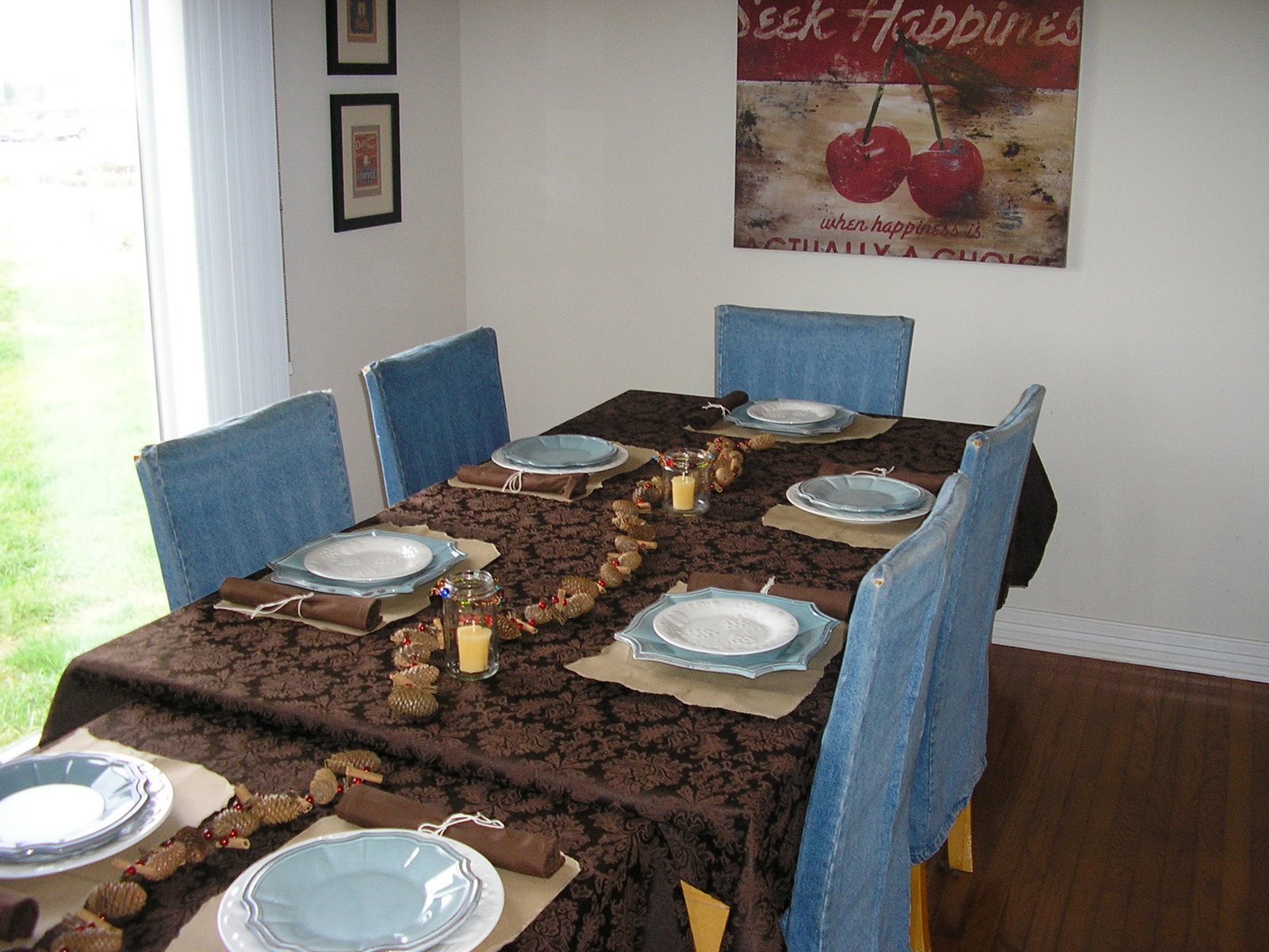
This is a table setting that can be put together easily & inexpensively, yet look fabulous & festive!

The theme ~ a rustic holiday, since the first Thanksgiving was more than a little rustic! Same could be said for the first Christmas.

First order of business ~ tablecloths. I went with two brown damask tablecloths from Target.

Also threw in three sets of four plain brown cloth napkins – but they weren’t the matching set for the tablecloth…don’t want things to look too matchy-matchy.

I wrapped the silverware in the cloth napkins & tied them with twine.

For the placemats, I tore up brown paper bags, which were free for the asking at the local grocery story.

For the table centerpiece, I picked up two strands of pine cone & cranberry garland from Target. The garland was topped off with three fabulous handmade recycled glass beaded votive holders.


Since I don’t have 11 place settings of either of the two sets of dishes I own, I mixed & matched, which worked out well & was really cute!


The end result was a lovely table setting, which just about anyone could create a variation of for their table for Thanksgiving, Christmas, or just to beautify your table for winter.

But more important was the opportunity to sit down & have a wonderful dinner with my family. Now that’s something to be thankful for!

faded memories

7 November 2007 by Andrea Leave a Comment

Last week, I was driving down a country road that I frequent to avoid the traffic in my town, and saw an auction sign at one of my favorite houses along that road.

My pulse quickened at the thought of vintage, maybe even antique finds! My rational mind encouraged me to put any such thoughts out of my head, because I have more stuff than I know what to do with right now!

As I drove past, I saw some fabulous & clearly vintage lamps outside the house that someone has already snagged. Envy burned in my heart for a moment.

But then something came over me.

Those lamps, and everything else being auctioned, and even that majestic home that is showing her age, they are all a part of someone’s life. The history of a family. Maybe even more than one generation.

Pieces of a life being sold off, one item at a time.

Suddenly I became very sad and hated that this home was being separated from its family and its history.

But what could I do? Nothing that I could think of. I’m sure the decision had already been made. The last resident had probably passed away or gone to a nursing home, and the remaining family members had a hard decision to make.

Then I became even more disillusioned when I drove by early this week & saw the windows were now gone. I hope that it’s going to be moved, but I suspect it’s a total tear-down.

I know she’s in disrepair, but she looks like she’s still got good bones…

I’d buy her if I could, but it’s not in the cards right now.

I’ll keep you posted.

quick & easy transformation

11 October 2007 by Andrea Leave a Comment

Sometimes, even a decorator has to compromise.

That would be the case in my studio.

When we moved into our new home just over a year ago, I was thrilled to have a large loft as my studio. It’s big, and the entire house is within earshot – perfect for a work-at-home mom. In fact, I call it the Eagle’s Nest, since I can be perched up there & monitor just about everything.

But it wasn’t long before I became a wee bit disenchanted.

Mostly because this great big, lofty space was loaded with boxes full of all manner of arts & crafts supplies that had to go somewhere.

And typical of a loft, it was a big, empty room, oddly without a lot of usable space.

So, I began to brainstorm about storage for the room.

The brainstorm continued, but the ideas weren’t exactly forthcoming.

Finally, I thought that getting built-ins might be the best idea, but after pricing the configuration I wanted, my pocketbook quickly vetoed the idea.

Which left me where I started – with a big, empty room, oddly without a lot of usable space and boxes full of all manner of arts & crafts supplies that had to go somewhere.

I called in my sister for her opinion, and after telling her everything that I wanted, she said, “You want it all!”

Of course I want it all! Form and function!

But, as a friend of mine recently said about a completely different topic, every situation has its limitations, and you’ll be better off if you can figure out what those limitations are and work around them.

Sage advice, especially when considering a decorating project!

Because I can’t stand “visual noise,” I really wanted closed door storage. An armoire would have worked, but I couldn’t find one that I liked enough to spend the money on. I had some great ideas for some antique pieces, but couldn’t find those either.

Finally, I decided to take a cheap & easy approach.

A white laminate utility cabinet from Lowe’s for $218. Plus, for an extra $60, I got it delivered & assembled in my home.


It served the purpose, but wasn’t terribly stylish.

So, I decided to change the door handles to a more funky, stylish pair – the Modern Heidegger Pull in Brushed Stainless by Pacific Modern Hardware.

It made all the difference in the world, transforming a utility cabinet into a mod armoire.

Changing the door pulls only took about 10 minutes, and cost only $9.99 for each pull.


A quick, easy, and inexpensive transformation! That is unless you count the gorgeous chair I bought for $199 while I was shopping for the pulls!

At least it was on sale!

simplify

10 September 2007 by Andrea 1 Comment

Recently, I’ve been thinking a lot about simplicity. Thinking about what it means to simplify. Or, more specifically, what I need to do to simplify.

Simplicity may seem counter to what a decorator stands for. After all, don’t we fill houses with stuff?

Well, sort of.

Decorators choose special elements to make a house a home. To be able to focus on the unique, special aspects of a home, there must not be clutter & chaos.

An excellent book on the subject of eliminating clutter is It’s Just Too Much by Peter Walsh of the television show Clean Sweep.

One of the things Peter focuses on in the book is the emotional attachment we have to things. Often, we feel that we can’t get rid of something because of the memories associated with it, even if we no longer need or use that particular item.

He sings the tune that we must realize decluttering doesn’t mean we have to get rid of the memories.

Even though you & I may not have newspapers piled up to the ceiling, and probably aren’t candidates for Clean Sweep, I would bet that many of us are holding on to something that we could afford to let go.

So, I challenge myself, and I will challenge you too…start to look at everything you own. If you love it & it has a place in your home, keep it and treat it with the respect if deserves.

If you don’t love it, or have ambivalence about it, pass it on to someone who needs it or will love it.

Simplify your life by simplifying your stuff.

mother knows best

8 May 2007 by Andrea Leave a Comment

After reading my blog entry about Message Central, my mother commented, “The cabinets look really cute, but you know me, I couldn’t handle the chalkdust.”

As they say, Mother knows best!

After only one day of 2 kids drawing all day on the new chalkboards, I couldn’t handle the chalkdust either. Fortunately, my sister, who is an elementary school teacher, informed me that I could purchase dustless chalk. Hallelujah!

You can order dustless chalk online at Discount School Supply for mere pennies. It comes in white & vivid colors. A worthwhile investment to accompany any chalkboard!


Proper accessories are always important, even for a chalkboard!

message central mission accomplished

5 May 2007 by Andrea 7 Comments

I finally gave up on trying to find the perfect blackboard tiles & decided to paint our pantry cabinets with magnetic paint, followed by chalkboard paint, hoping with each stroke of the roller that we don’t sell the house before I do an extreme kitchen makeover (i.e., a major kitchen remodel to make the kitchen actually work sensibly!)

Let me walk you through the process of creating Message Central on our pantry doors.

First, I taped off the area around the inset…


Then I wisely laid down a drop cloth. Since it was such a small job, I actually considered not using a drop cloth, but fortunately I didn’t go with that line of thought, because here’s how the drop cloth looked after some painting…


Yikes! That would not have been good for the hardwood floor!

Finally the prep work was complete and I broke open the magnetic paint. Actually, it was a magnetic primer, black & very thick, since it actually has iron filings in the paint.

Perhaps I have pica, but when I stirred the magnetic primer, I wanted to taste it so badly! It looked so thick & delicious, like brownie mix!

I resisted the temptation to taste the paint, and proceeded to use it as intended.

The magnetic primer was not the easiest paint to work with. The directions indicated that it is normal for the paint to have a watery layer at the surface, which it did, and that didn’t make life easy.

Magnetic primer has a texture, because of the iron filings, so it’s essential to roller it on very evenly.

I used three coats of magnetic paint, as indicated by the manufacturer. Each “coat” actually consisted of going over the area twice, then letting that layer dry for 30 minutes. It took about 30 minutes to complete one coat on all of the doors, so the project moved along rather quickly, taking only about two hours from prep to completion of the magnetic primer layer.

Here’s how the doors looked after the magnetic primer was completed…


As you can see even in the photo, the magnetic primer has lots of texture.

The primer needs to dry for 4 hours prior to painting, but because I got a late start, I waited overnight.

The next morning, I started with the chalkboard paint. This paint was easier to use than the magnetic, but still not a walk in the park, since the roller marks were very obvious.

The chalkboard paint took 4 carefully applied coats, again with each coat consisting of two thin applications, being very mindful of the roller marks.

Because of the small area being covered, this part of the project was also very quick, about 3 hours, including a leisurely coffee break and clean-up time.

Here’s the final product, looking terrific!


I really love how it turned out – it gives our brand new kitchen a vintage schoolhouse charm! And the kids can hardly wait to start using chalk on it, but it should “cure” for 24 hours, and then be “conditioned” by rubbing the side of a piece of chalk over the entire surface, then wiping with a barely damp sponge. Make it easy on yourself & use a chunky piece of sidewalk chalk to make the conditioning move along faster.

Because of the magnetic primer, the chalkboard has more texture than I would have preferred – it has almost a vinyl appeal. But, I really need the magnetic aspect, allowing me to post this & that paper on Message Central, so I’ll make do with the texture.

I’m not much of a long project type, and this one was quick, easy, and rewarding! I’m ready to start magnetizing & chalkboarding more surfaces throughout the house!

How about you? How did you use magnetic & chalkboard paint? Send your project photos & story to me at andrea@homagestyle.com. Maybe we’ll post your project here!

Showing off at the Whisperwood Cottage Chalk Talk Link Party…

desperately seeking message central

2 May 2007 by Andrea Leave a Comment

As you may know, I’m desperately seeking chalkboard materials to create Message Central in my kitchen.

The reason that I am desperately seeking a chalkboard product, is that I am trying not to end up painting my cabinets with chalkboard paint. Even though I’m more adventuresome than most with decor, I’m still a little skittish about a permanent change to the kitchen cabinetry.

It just so happens that the kitchen cabinets are the perfect location to create Message Central in our home.

So imagine my joy when I saw these new Modular Chalkboard Tiles from Pottery Barn.


They really are terrific, although they didn’t work for my purposes. The very thing that makes them great – that they’re very sturdy & heavy – is why they didn’t work for me. I need something lightweight to attach to my cabinet doors. But they would work well in a kid’s playroom, or if you were creating your Message Central on a blank wall, rather than on cabinets.

Ultimately, I may end up keeping them for another room, but as for Message Central, I may need to accept that to create message central, I need to paint the cabinets!

let’s hear it for white walls

28 April 2007 by Andrea Leave a Comment

After several posts about the virtue of diving into a house full of colors, I must confess that I live in a world of white!

Our home is a new build, and we’ve only been here for about 9 months, so the walls are still builder white.

And I hate it.

But…

Even though having white walls is the equivalent of store brand coffee when I can have a Starbuck’s Iced Mocha, in my opinion, it’s important to live with the house for a while before jumping into paint colors.

Often, in my experience, the house will speak to you & tell you which colors will work.

Plus, many times you may consider several different versions of a room. Waiting it out a bit gives you time to ponder & think about what will make you happiest.

For example, one of the possibilities that I’ve considered for my kitchen is to paint one full wall with black chalkboard paint. When I came up with the idea, I was thrilled, and almost ran out to Lowe’s that minute.

Good thing I waited…

Upon reflection, I realized that painting an entire wall would mean lots of chalk graffiti by the kids, which, in turn, would mean lots of chalk dust, and I’m not the world’s most stellar housekeeper. I’d have to stay after school every day to wash the board!

Then I also realized that the real reason for painting the wall as a chalkboard – to create “message central” wouldn’t work either, because the wall is primarily in the dining area, not the cooking area, which is where I need my “message central.”

Waiting also helps to reinforce that your original plan is the one you want.

For example, I plan to paint my guest bathroom a deep brown, with a hint of blue & maroon. I’ve had several paint chips taped to the wall for months now, and even though it’s a very dark color for a small room, it’s the color I love & keep coming back to.

So, take your time & let the walls and rooms speak to you.

how color affects your world

27 April 2007 by Andrea Leave a Comment

Color has a powerful effect on human beings. Science has even proved this to be true. Here is how color affects your world.

Black

Black is a powerful, classic color. When used with another color, such as white, salmon, or teal green, black creates a sense of heightened drama and contrast.

Blue

Blue, the color of the sky and the sea, is a cool, serene color, known to lower blood pressure and pulse rates. Blue is a traditional, conservative color that emanates dignity and harmony.

Brown

Brown, a comfortable, earthly color, is solid and warm, inviting thoughts of things from natural, such as clay, wood, or leather.

Gray

Gray is a soothing, dignified color that can establish a calm feeling in a room.

Green

A restful, soothing color, green is refreshing, as well as tranquil. Green, a familiar color that surrounds us in nature, can bring a freshness to an otherwise plain room.

Orange

Orange is a warm, yet intense hue that is known to stimulate the appetite. Although orange is an energetic color, it is usually too aggressive for an entire room and should be used as an accent color or in a toned down form, such as peach.

Pink

A youthful and romantic color, pink conveys happiness and is know for its calming qualities.

Purple

Purple, a luxurious, sensual color, has been associated with royalty and dignity throughout the ages. Purple is a great backdrop for family areas of a home.

Red

Red is an energetic color associated with passion and excitement. This warm, strong color can raise your blood pressure, pulse rate, and your body temperature! Red is even said to stimulate conversation and the appetite, which makes it an ideal color for your dining room.

White

White is a classic color that lends a bright, open, and airy look to any room.

Yellow

An upbeat, happy color, yellow radiates warmth and optimism. Yellow is known to speed your metabolism and is thought to enhance memory and concentration. This strong, bright color is best used sparingly or as an accent color.

taking a risk with color

27 April 2007 by Andrea Leave a Comment

Be brave with color!

Dare to choose a shade other than white or off-white. After all, if you don’t like it, you can easily and inexpensively change the color, simply by repainting!

If you can’t bear to paint an entire room, add color to at least one wall. You may find that you enjoy the effect and may soon paint the rest of the room, and after that, you may go on a painting spree throughout your entire home!

If you’re still unsure about painting a room, try adding accessories to the room that are in the same color family as the paint color you’re considering. That will help you to discover if the effect of that color is appealing to you.

« Previous Page
Next Page »
  • Email
  • Facebook
  • Instagram
  • Pinterest
  • Twitter

subscribe, baby!

Homage Style on Twitter
Homage Style on Facebook
Pin me! Homage Style on Pinterest

archives

WORK IN PROGRESS...

work in progress :: rose painting

FAVORITE PROJECTS...

the tornado lounge

another glorious chalkboard project

freshening up the family room

industrial chic curtains

angsty teen boy's room

almost instant art

vintage cowboy room

Copyright © 2026 · Beautiful Pro Theme on Genesis Framework · WordPress · Log in